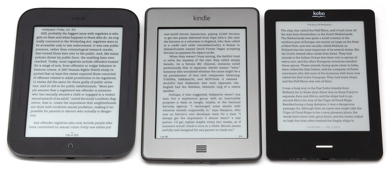
They all have the same E-Ink Pearl screen with the same contrast, the same resolution, and the same type of IR touch-screen sensor. (Any screen differences in the photos are the result of uneven lighting, not any real differences.)
They’re all available for $99, but the Kindle and Kobo both show ads (“special offers”) at that price — if you’re looking for an ad-free reader, the Nook is the least expensive at $99, with the ad-free Kobo at $129 and the ad-free Kindle at $139.
The Nook is particularly good for magazine availability, even slightly exceeding the Kindle’s availability in my searches. But Barnes & Noble’s content store is very buggy for me: I often get errors claiming unspecified problems with purchases, downloads, or connectivity. (This also happens on the Nook Tablet.)
Kobo’s ecosystem is still a disadvantage. In my searches, while book availability was pretty good, it had the highest prices most often. And critically, its magazine and newspaper selection is abysmal — if you intend to read magazines or newspapers on your e-reader, you shouldn’t consider Kobo.
Hardware and bezels
They’re all similar sizes. The Nook is the thickest and chunkiest. The Kobo is the lightest, at 185g versus 211g for the Nook and Kindle.
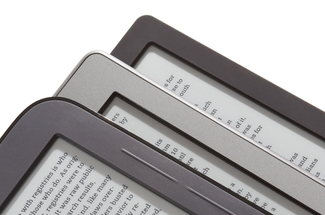
The thick IR-touch bezels are all deeper than on non-touch readers. The Nook’s is deepest and the Kobo’s is the most shallow:
From the top of the stack: Nook, Kindle, Kobo bezels under diagonal lighting
As I emphasized with the lighting angle here, the deep IR bezels cast shadows onto the screen margins. This is especially noticeable with close, single-point light, like a lamp on an end table or night stand.
The shadows amplify the perceived depth of the bezels, and they can be particularly problematic when they cover text or interface elements too close to the screen margins. The deeper bezels also make it more awkward to hit touch targets near the screen edges.
The Kobo’s touch sensor seems to work as well as the others, so I’m curious why the Nook and Kindle needed such deep bezels.
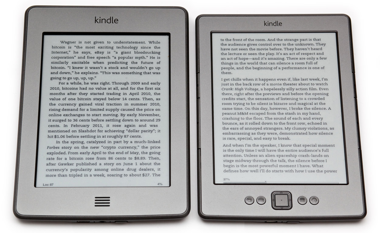
The non-touch Kindle 4
The 2011 $79 Kindle with buttons, which people have settled on calling the Kindle 4 (therefore, so will I), remains a strong competitor here, too.
Kindle Touch (left) and Kindle 4
Compared to all three touch readers, it’s cheaper ($79 with ads, $109 without), thinner, and noticeably lighter (166g).
It lacks the audio features of the Kindle Touch and previous Kindles, such as text-to-speech and MP3 playback, but I’ve never used those features or seen anyone else use them. (If you actually will use those features, the Kindle Touch is the only option for you.)
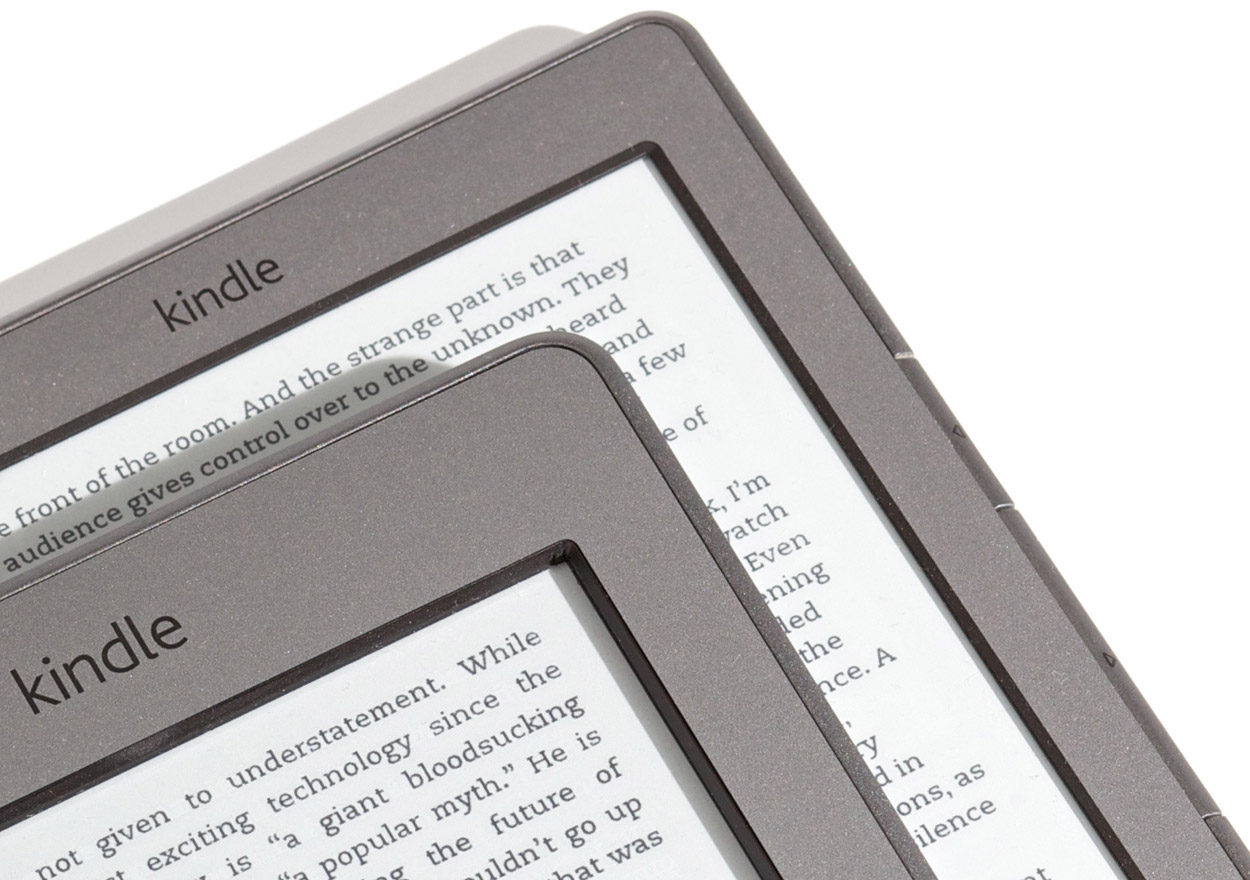
The Kindle 4 also has a shallower screen bezel than any of the touch readers:
From the top of the stack: Kindle Touch, Kindle 4 bezels under diagonal lighting
Again, this reduces shadows in the reading area and make it easier to read with light hitting the screen at an angle, which for me is almost always.
Page-turning and performance
The Kobo Touch is the slowest at page-turns, followed closely by the Kindle Touch. In fact, my old Kindle 2 turns pages slightly faster than the Kindle Touch. I’ll come back to that in a minute.
The Kindle 4 and Nook both turn pages at about the same speed (I can’t tell the difference, at least), and they’re much faster than the others. This is interesting: the Nook’s speed means that it is possible to make a touch-screen e-reader turn pages as quickly as one with buttons.
Of the touch readers, only the Nook has hardware page-turn buttons that you can optionally use, but they’re uncomfortable to use because they require too much pressure. On the Kindle and Kobo, you must turn pages by tapping the screen. I wish they all had good page-turn buttons — you’d think the hardware would be optimized for the most common action that people perform when using e-readers, but that’s unfortunately not the case.
With page-turn buttons, you can simply rest your finger on them while reading and push down slightly to advance to the next page. I miss this ability on the touch readers: you need to move your finger from wherever it’s resting (which can’t be the screen, of course) into the screen area and tap each time. My ideal e-reader would have a touch screen as responsive as the Nook’s and good hardware page-turn buttons, but that doesn’t exist today.
Don’t worry, fingerprints aren’t very noticeable on the touch readers. The matte e-ink screen surface minimizes their appearance, and they’re easily wiped off.
The mysteriously slow Kindle Touch
The entire Kindle Touch interface feels sluggish. Page turns, menus, and navigation all respond to touches only after lengthy delays. Its overall performance is similar to the Kindle 2.
Here’s a quick video of the Kindle Touch and Kindle 4, side by side, turning pages and then going to the home screen:
Page-flipping responsiveness of the Kindle Touch (left) and Kindle 4. Download.
E-ink is always sluggish compared to traditional LCDs, and the IR touch-screen could plausibly add latency to touch responses, but we know from the Nook that it’s possible to make a much faster touch-screen e-reader than the Kindle Touch.
It doesn’t seem like the touch input is at fault. Even pressing the home button on the Kindle Touch results in a long delay before the home screen appears. The Kindle 4 is much faster at that, and everything else. Presumably, the higher-end Touch doesn’t have a slower CPU, so this is likely a software problem.
The Nook Simple Touch wasn’t particularly fast when it launched nearly 6 months ago, but Barnes & Noble improved its performance with software updates, and it’s now just as responsive as the non-touch Kindle 4. I hope Amazon can achieve similar gains with a software fix for the Kindle Touch very soon, because its sluggish performance makes it difficult to recommend.
Text controls
Both Kindles’ text controls are mostly unchanged from the Kindle 3 (now renamed the “Kindle Keyboard”).
My impression of the Nook’s text controls still stands from the review: I can’t find a comfortable margin width or text size, since the increments available are too far apart. The margin is especially problematic: the smallest-margins setting, the only usable width in my opinion, puts the text too close to the deep bezel and its shadow.
The Kobo’s controls are very good, with very fine-grained increments for text size, margins, and line spacing. It’s also the only one to offer a toggle for text justification. Since it won’t hyphenate, its justification isn’t very good, but it’s nice to be able to turn justification off.
The Nook and Kindles often justify text with no option to disable it. The Kindles won’t hyphenate at all, and the Nook hyphenates too aggressively.
All of the readers except the Kobo use book-style indented paragraphs, while the Kobo uses web-style block paragraphs.
The Nook and Kindles offer the nice Caecilia font (the only Kindle font available before the Kindle 3), which I prefer to the other options available on those readers. The Kobo doesn’t, but its default Rockwell font is similar and is also highly readable on e-ink.
Touch versus non-touch controls
The biggest problems I keep running into with the touch readers are non-obvious tap zones and gestures.
When navigating lists and menus, I often find myself wondering where I’m supposed to tap, and whether I should tap, tap-and-hold, or swipe. This is exacerbated in magazines and newspapers, since reading them involves so much navigation.
The interfaces are more obvious on the non-touch Kindle 4, since hardware buttons and on-screen cursors and highlights make it more obvious what to do. But I also keep touching the screen and being disappointed that it “doesn’t work”.
I thought touch readers would be definitively better than non-touch models, but I was wrong: in reality, it’s a toss-up.
Magazines and newspapers
You’d think a touch e-reader would be a huge improvement for magazines and newspapers. Jumping between sections and articles can be faster on a touch screen, but it isn’t always.
Periodical navigation is most intuitive to me on the Kindle 4, followed by the Kindle Touch. I perform navigational errors more often on the Nook. (I didn’t test periodicals on the Kobo because the selection is so poor.)
This was a surprise: I expected the Kindle Touch to be the best for periodicals, but its poor performance hurts it, and navigating lists can be unintuitive.
Highlights, notes, and typing
The non-touch Kindle 4 is understandably awful at text input, requiring you to move a cursor around the on-screen keyboard with the directional buttons to select each letter (arranged alphabetically, not as a QWERTY keyboard), much like the painful process of entering text on a game console or an Apple TV. If you plan to do a lot of highlighting and note-taking, definitely don’t get the Kindle 4.
Highlighting and note-taking on a touch reader is much easier, but it’s still not as easy, responsive, or precise as on an iPhone or iPad.
Among the touch readers, the Kindle Touch has the worst text selection: you need to tap and hold on the first word, then drag to the last word and release. There’s no way to modify a selection if you want to expand or refine it, and it’s difficult to reliably get it right the first time. The Nook and Kobo both offer iOS-like “handles” on the sides of the selection that you can easily drag to refine it. The Nook is best here, beating the Kobo in responsiveness.
You really shouldn’t type on an e-ink device if you can help it. Like text selection, it’s nowhere near as fluid, accurate, and responsive as an iPhone’s virtual keyboard. Even a moderately fast iPhone typist will easily be able to outpace the e-ink refresh rate, leading to a lot of errors and delays to review what was typed.
If you must type a quick note, the Nook is again the best option, although it and the Kobo have an annoying grid keyboard layout. The Kindle Touch has a more traditional staggered-row layout, but its poor responsiveness interferes too much.
You could also consider the Kindle 3, which Amazon still sells as the “Kindle Keyboard”, since it still has a physical keyboard. Its tiny, clicky, grid-layout keyboard is pretty bad, though. The Kindle Touch’s on-screen keyboard might be faster for most people.
But all of these e-readers are very bad for text input. If you take notes while reading or otherwise intend to type a lot, an iPad running the Kindle, Nook, or Kobo app is probably a better choice than any e-ink reader.
3G and web browsing
All of these readers can connect via Wi-Fi for content downloads and web browsing (except the Nook, which lacks a browser).
Only the Kindle Touch and Kindle Keyboard offer optional 3G connectivity for an extra $50. It’s an unusual setup: there’s no monthly fee for data access, ever, for the life of the device. It just has connectivity as long as you’re in an area covered by AT&T. (It sometimes works internationally, but small fees are usually involved.)
On previous Kindles, you could use the 3G connection with the built-in web browser to have an effectively “free” cellular web browser indefinitely, but that party has mostly ended: the Kindle Touch can only use the connection to shop in the Kindle Store, receive new issues of periodicals (or Instapaper), or browse Wikipedia. Any other web browsing requires Wi-Fi. Only the Kindle Keyboard can still browse to any site over 3G.
This is mostly moot, since the web browsers are terrible. They’re all extremely slow and painful to navigate. Web navigation on the non-touch Kindle 4 and Kindle Keyboard are especially bad, since you need to move around a little mouse pointer with the directional buttons to click on anything, but I wouldn’t call the touch experience usable either.
E-ink web browsing is a novelty that you’ll probably try exactly once. But if you actually intend to do it a lot, and can’t or won’t buy an iPad, the Kindles have a better and more full-featured browser than the Kobo.
The value of the 3G Kindles, therefore, is primarily in their ability to download new periodicals and shop for new books away from home. If you travel a lot away from Wi-Fi, especially if you also subscribe to a daily newspaper or buy new books constantly, the 3G models might be worthwhile.
For most people, I don’t think the 3G is worthwhile. I thought I’d use it regularly on my Kindle 3, but in practice, I hardly ever did. I chose not to get 3G on my Kindle 4 and Kindle Touch, and I haven’t missed it yet.
Using Instapaper
If you’re trying to use my Instapaper service with your e-reader, the best choice is one of the Kindles. (Actually, the best Instapaper experience by far is on the iPad. But I’ll assume here that you’re interested in an e-ink reader.)
The only way to get Instapaper on the Nook or Kobo is to download an ePub file manually from the Instapaper website and transfer it over USB every time. This is tedious, and most people probably won’t make a habit of it.
If you have a Kindle (any Kindle), Instapaper can use Amazon’s document-delivery service to automatically send a new “issue” every day, every week, or on demand with a simple action on the website. This is much more convenient than manually transferring a file over USB whenever you want new content.
But Instapaper on Kindles isn’t perfect. I’ve been able to generate newspaper-style navigation that works on all non-touch Kindles, but the Kindle Touch and Kindle Fire use new periodical-navigation formats that I haven’t been able to successfully generate yet. I don’t know if Amazon will ever make this possible. And recent changes to Kindle “personal document” storage makes it difficult to delete old Instapaper articles from the Kindle Touch.
So, until (and unless) I can find ways around the Kindle Touch’s quirks, the best e-reader for Instapaper is the Kindle 4.
Ads?
You can save $30-40 on the Kindle 4, Kindle Touch, or Kobo by opting for “special offers”, a euphemism for ads. I haven’t seen Kobo’s ads, but on the Kindles, the ads replace the pictures of classic authors on the sleep screen (see my Kindle 4 review), and they also appear as a bottom banner on the home screen.
On the Kindles, the ads aren’t intrusive, and if you get an ad model and change your mind later, you can just pay the difference and get the ads removed. So it’s not much of a risk to just get the ads.
If you’re getting it as a gift, though, you should probably get the ad-free models. Maybe it’s just me, but I’d feel tacky giving an ad-filled Kindle or Kobo as a gift.
If you’re going ad-free, the Nook becomes the cheapest: it’s always $99 and always has no ads.
What about the Kindle Fire, Nook Tablet, or iPad?
The $199 Kindle Fire and $249 Nook Tablet are also options. (So is the similar $199 Nook Color, but the Tablet is a much better product for $50 more.)
I reviewed the Kindle Fire and determined that it’s really not a good product, mostly due to very poor software and performance.
I haven’t written a review of the Nook Tablet yet, but after some light use, it seems like a much better product than the Kindle Fire. That said, it still shares many of the downsides if you primarily intend to use it for reading: these tablets are more expensive, bigger, thicker, heavier, and more complicated than e-ink readers, and they have less-readable LCD screens and much worse battery life. You can bring an e-ink reader on a week-long vacation and leave the charger at home, but tablets need to be charged almost as often as phones.
The iPad shares most of the other tablets’ downsides, but it does have the unique ability to run all of the e-reading apps: Kindle, Nook, and Kobo. (And iBooks, which only works on Apple’s devices, but doesn’t have noticeably different availability or pricing compared to Amazon or Barnes & Noble.) And it’s the best Instapaper reader.
A full-fledged tablet can be a better choice than an e-ink reader if you plan to watch videos or play games a lot, or if you need more general-purpose computer-like functionality such as email and web browsing. But these come at the expense of reading quality. For most people, the selection of videos and games is going to be much better on the iPad than on the Kindle Fire or Nook Tablet.
Despite the color screens and much better touch responsiveness, I can’t recommend the Kindle Fire or Nook Tablet for magazines or newspapers. The experience reading them is too poor due to sluggishness, bugs, poor navigation, and software complexity. The iPad is a much better tablet for periodicals.
If you’re primarily in the market for an e-reader, get an e-ink device. And if you’re looking for a tablet for apps, games, and videos in addition to reading, unless the iPad’s price is absolutely out of the question forever, I suggest getting the iPad.
So which e-ink reader?
All of these readers have exclusive features that I haven’t covered here, primarily because I haven’t needed to use them, and I bet most people won’t. In reality, what matters for e-readers most of the time is content availability, price, size, interaction (buttons or touch), and performance, roughly in that order.
The Kobo Touch is a decent product, and its hardware is quite good: it’s thinner and lighter, with a more shallow bezel, than the other touch readers. It’s almost as compact as the non-touch Kindle 4. But its advantages don’t outweigh its slow page-turns, often-higher book prices, and almost nonexistent periodical availability. So for now, I can’t recommend the Kobo.
The Nook Simple Touch’s fast performance and low ad-free pricing embarrasses the other touch readers, and its catalog is as good as Amazon’s. But it gets a lot of important details wrong, such as the poor granularity on text controls, the clunky swipe-to-unlock, and the buggy store. It’s also the thickest and widest, and its deep bezel casts the most shadows on the text. But it’s a good choice. If it was my only e-reader, and I didn’t want to use Instapaper, I’d be mostly satisfied.
The Kindle Touch is almost a very good product, but its poor responsiveness is distracting. The Nook shows that this probably could be fixed in a software update, but we’ll see if Amazon actually does: historically, Kindles have received very few software updates, and they usually don’t include major changes. The Kindle Touch is still a good choice, and it’s my favorite of the touch readers — but it just barely edges out the Nook. (And the Nook is six months old. I’m curious to see the next one.)
The low-end, non-touch Kindle 4 is actually my favorite e-reader today. It lacks the easier text selection and periodical navigation of the touch readers, and it’s effectively impossible to type on, but neither of those interfere with the most common actions when reading. It’s faster, thinner, and lighter than all of the touch readers, the interface makes the most sense and is the most responsive, and it works best with Instapaper.
If you’re ordering one of the Kindles from Amazon’s U.S. store, I’d appreciate if you’d use one of my affiliate links:
Mozilla has lost share to Google, it’s lost the loyalty of enterprise customers, and it’s lost key talent. And a deal with Google that supplied 84% of its revenue last year was scheduled to end in November.
Most Firefox users don’t know how the company pays its bills. The majority of its income — about $100 million annually — is from Google, who pays Mozilla for using Google by default in the stock homepage and built-in search box.
But the term of that deal just ended, and apparently nobody from either Mozilla or Google will confirm whether it has been renewed. I’m sure Google would renew it at the right price, but as Chrome chips away at Firefox’s marketshare, it probably isn’t worth the same price to them anymore.
It might be worthwhile for Google just to keep Microsoft from buying that promotion for Bing. Because if anyone’s willing to throw massive piles of money at gaining marketshare that isn’t worth anywhere near what they spent to gain it, it’s Microsoft. Given the history between Firefox and Internet Explorer, though, it would be pretty entertaining if Microsoft made such a deal, effectively sponsoring Firefox’s continued development.
I’m a bit sad for Firefox. It used to be the fast, powerful, progressive browser that finally broke IE’s era of stagnant dominance and saved web developers’ sanity. Now, it’s a bloated, slow, unstable monster that’s often a pain in this web developer’s ass.
It’s losing marketshare to Chrome for very good reasons. There’s no place for it in mobile, where most of the growth and action is happening in the industry, and most of their other recent attempts at new platforms and products have fizzled out.
I’m not sure Firefox can be saved. It might continue for a long time as a fringe browser choice, like Opera, but I don’t see how its marketshare will ever increase again.
There’s a lot of great insight packed into Jakob Nielsen’s Kindle Fire usability analysis, but I especially loved this point about the 7” tablet market’s near-term prospects:
If the platform becomes a raving success and quickly sells in large numbers (say, 50 million copies by end of 2013), then we’ll have an economic foundation to support a rich ecosystem of 7-inch-optimized services. …
On the other hand, if only a few million 7-inch tablets sell over the next year or two, then the platform will either die or be reduced to serving poor people who can’t afford a full-sized tablet. A small audience won’t offer much incentive for providers to publish 7-inch-optimized content and services. The resulting unpleasant user experience will drive any remaining affluent users to buy bigger tablets.
The same can be said for most app platforms as well.
Thanks to OmniGraffle for supporting the Marco.org RSS feed this week:
OmniGraffle is the easiest and most elegant way to create website wireframes, process flows, organization hierarchies, and, frankly, almost anything.
Rely on OmniGraffle to create beautifully simple documents to share with anyone. Even through an TV.
Created for both Mac and iPad, OmniGraffle’s smart shapes, stencils and contextual styling elements gracefully guide you from rough outline to pixel perfection.
But when people ask how many OS versions they should support in their new app (which they do, often), they’re not looking for a common-sense and at least reasonably evidence-based answer like that. Instead, they’re looking for this answer:
It’s OK to support only the newest version of the OS.
That’s what they want to hear. Honestly, I think it might even be true, but I know that we all want it to be true. So to help you to convince yourself, here are the relevant arguments conveniently collected in one place.
Great points.
If I were launching a new app today, I’d make it require iOS 5. I’d save a lot of work that way. But here’s another data point.
Bruce “Tog” Tognazzini on the difficult design decisions of search:
The Mail search for iOS is hopeless. You have to specify which folder the message is in. If I knew that, I probably could have just pawed through that particular folder and found it. Strangely, the Spotlight search at the Springboard level in the exact same iOS has no problem searching across all mail folders. Why should you have to know to avoid the built in search and, instead, leave Mail, go to the desktop, then to Spotlight, in order to look for an email? It makes no sense.
Search caused me an interesting problem with Instapaper. In the 3.0 app, I added a local search feature: it would search your articles, but only the ones that were downloaded into the app.
This was a terrible half-solution that I shouldn’t have shipped, because it didn’t match people’s expectations: most customers expected the search box to search everything in their account, regardless of what’s downloaded in the app at that moment. No amount of interface massaging or explanatory text would fix that.1
The only good fix2 was to replace it in Instapaper 4.0 with a search that worked properly: a server-side index that searched everything they’ve ever saved. Server-side search is expensive and I couldn’t afford to do it for everyone, so I limited it to the $1/month Subscribers, and provided the Subscription as an in-app purchase.
Most customers never used the local search in 3.0, so they didn’t notice the feature switch, but a few people have been very angry and very vocal about it. It’s by far the only widespread problem that 4.0 has caused me. I’ve gotten tons of 1-star reviews from the sliver of people that I’ve angered by “charging for a feature that used to be free”. They don’t realize (or don’t care) that it’s much better for many reasons now, and it’s really not “the same” feature at all.
To most customers, search is just expected to be there, and it’s expected to search everything all the time. They don’t realize and don’t care how much complexity is behind the scenes to make it happen. The best designs hide as much of that as possible and just present the customer with a single search box that works.
The local-only search sucked for a lot of other reasons, too. It doubled the size of the code, dramatically slowed down updates and launch times, and didn’t support any advanced linguistic processing or operators. ↩︎
I tried a hybrid approach that kept both local and server-side search, like Mail’s, but it sucked even more (…like Mail’s): the interface was awful and confusing, it still didn’t “just work” for most people, and the app still had to include and run all of the big, slow search code. ↩︎
Dan Seitz at Guyism posted this marvelous linkbait, but I’m falling for it because I think it’s hilarious:
The Apple iPad 2: Why are we recommending you not bother with this one? Because the iPad 3 is inevitable next year, and there might even be two of them. It’s not worth $500 for a device that will be obsolete in three to five months.
The most popular and best-rated tablet by far, the one that defines the entire tablet category, should be avoided when buying it as a gift for someone else1 because a new model for this product that’s typically on a 1-year cycle might come out in three to five months.
As soon as that happens, the one you received as a gift this month will be obsolete, which means that it will cease to be useful for modern-day tasks. (Ask owners of the 22-month-old iPad 1 whether their tablets are still useful.)
OK. So which tablets should we buy? Apparently the Asus Transformer Prime, a hacked Nook Color, or the “not fully functional” Nook Tablet.
How useful will any of those be, as tablets, in 22 months? How about that “obsolete” iPad 2?
Imagine the look on the recipient’s face when, hoping for an iPad, they open up a suspiciously small box to reveal an opened, rooted Nook Color.
What if a little site you love doesn’t have a business model? Yell at the developers! Explain that you are tired of good projects folding and are willing to pay cash American dollar to prevent that from happening.
The sheer volume of people asking me for this was one of the biggest reasons I launched Instapaper’s $1/month Subscription program, which offers almost nothing for the money — just the knowledge that you’re supporting a service you like.
People pay out of sheer goodwill. It really works.
I like to urge designers to always ask themselves: “Does this logo look like a penis?” The answer has to be a resounding “No”. If there is just a slight hesitation, then it probably does look like a penis.
Google’s Eric Schmidt, predicting that Android will overtake iOS within 6 months as the platform developers target first:
“Ultimately, application vendors are driven by volume, and volume is favored by the open approach Google is taking. There are so many manufacturers working to deliver Android phones globally,” Schmidt said. “Whether you like Android or not, you will support that platform, and maybe you’ll even deliver it first.”
Is that a prediction or a threat? (update: bad transcription, see below)
Is he implying that Android is widely disliked, and it doesn’t matter to him?
Why does Google let Eric Schmidt speak publicly? Has it ever turned out well?
One Android-toting audience member said he was frustrated to see iOS apps beating Android versions to market. But in part because of Ice Cream Sandwich, “my prediction is that six months from now you’ll say the opposite,” Schmidt said.
Developers only need to ask themselves a simple question when considering whether to put much faith into Schmidt’s statements: What will be different in 6 months?
Android devices have been selling in large quantities for a long time. That’s not new. Yet today, compared to iOS, Android is much less profitable for developers (especially for paid apps), its users are less influential for expanding new services, and its app development is much more painful and expensive. And in the rapidly growing and increasingly influential tablet market, Android has an extremely low marketshare.
Will Google’s release of Android 4.0 result in a significant improvement to any of these issues?
Update, December 8
CNet somewhat misquoted Schmidt. There’s now a video posted of the LeWeb session, and here’s what he actually said:
Question from audience member: Android has certainly caught up in terms of features and units and you guys have done a great job, yet it still seems like application developers, Flipboard being a great example, still focus on iOS. And developers often say, for all of the travails of Apple’s running of it, it’s the platform. Do you need to do anything to create either another tier, or tools, or encouragement, or funding, or something for the best applications that, whether it’s Flipboard or others, to end up on Android? Because there’s an increasing dissatisfaction for Android users like myself saying, “Hey, what about us?”
Schmidt: First, it’s an excellent question. I would say that it’s taken us a while. Our model of course is different, we have different hardware manufacturers. It’s taken us a while to get software that really is capable of delivering on the promise that you just articulated. I also would say that Apple has done an excellent job with iOS of delivering functionality that we all know about, and I think it’s just a superb piece of work. So with the ICS release, our core objective as a company is to get all of the hardware vendors onto that platform. With that, we’ve just from my perspective speaking personally, we’ve got the Android Market now, again took us a while, working well, both in terms of the ability to buy, to charge, carrier billing, all of those kinds of things. We recently introduced Google Music, with a big launch that we did in L.A., again it took us a while to get there. So my prediction is that 6 months from now, I think the question is exactly right right now, and 6 months from now, you’ll say the opposite. Because ultimately applications vendors are driven by volume, and the volume is favored by the open approach that Google is taking. That there are literally so many manufacturers who are working so hard to distribute Android phones globally, that whether you like ICS or not, and again I like it a great deal, you will want to develop for that platform, and perhaps even first. So think of it as a transition over the next 6 months.
The correct wording sounds a lot less like a threat. But the core message is the same. I think it’s safe to assume that in context, by “ICS”, he really meant Android in general once ICS is widely available, and the implications about quality and the “whether you like it or not” attitude certainly stand.
I apologize for inadvertently quoting a bad transcription, and I withdraw the “threat” accusation, but I stand by the rest of the post.
Shifty Jelly’s counterargument to some of my Android opinions, which provides a concrete data point showing that money can be made on Android, concludes with this:
Finally, we’d like to publicly challenge Marco Arment to bring Instapaper to Android and drop the negative attitude. We’ll bet you one large cup of our finest Australian Coffee that you’ll be pleasantly surprised by just how great the Google Market is. In many ways it’s a better place to be than iOS, since so many developers are ignoring it, and yet there is a massive install base waiting to give you their money.
I can’t afford to invest months of development time into learning the platform and making an Android app, then supporting and maintaining it in parallel with my iOS app indefinitely, with so many other data points telling me that it almost certainly won’t be worth the investment.
So I’ll make it more interesting. Instapaper has a public API. I’m not aware of any good, stable, feature-rich Android Instapaper clients that actually use it and aren’t just ripping off my iOS app’s private API.
If you make the first great Android Instapaper client that:
uses the official API
contains a significant portion of the iOS app’s features, the details of which we’d work out privately
runs on a wide variety of Android devices and OS versions including modern smartphones, the Kindle Fire and Nook Tablet, and whichever 10” tablet matters at the time of completion
is priced at $2.99 or higher in the U.S. with approximately equivalent pricing elsewhere, and satisfies requirements to be sold in the Google Marketplace, Amazon Appstore, and whatever B&N uses for the Nook Tablet
I’ll call it the official Instapaper app for Android, I’ll promote it on the Instapaper site, I’ll drop the subscription requirement for its API access, you’ll answer all support email that comes from it, and we’ll split the net revenue 50/50.
What do you say?
UPDATE: I don’t intend for multiple developers to compete for this with whoever gets it “first” winning, causing everyone else to have invested a lot of effort for nothing. That’s too close to spec work for my taste, and I wouldn’t ask anyone to do that.
I’m talking with Shifty Jelly and a small number of other developers to see if we should take this somewhere. If we proceed, I will choose one developer to proceed with before anyone else does any work.
The Twitter service I signed up for is one where people tweet 140-character posts, you follow those people whose tweets you tend to enjoy, and that’s it. The Twitter service this new UI presents is about a whole lot more — mass-market spoonfed “trending topics” and sponsored content. It’s trying to make Twitter work for people who don’t see the appeal of what Twitter was supposed to be.
This is the future of Twitter. Or, rather, the present.
I’d wager that all third-party clients will be forced to display the trends and ads within a year, and what we know as Twitter today — or at least what we knew until yesterday morning — will be a distant, quaint memory: Remember when it was just people you followed?
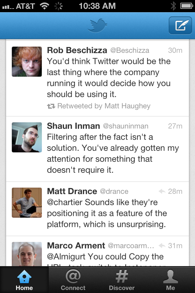
Tweetie, later acquired and made the official Twitter app, has always been my preferred client. But with yesterday’s release of Twitter 4.0 for iPhone, most of Tweetie is gone, buried under cluttered styling and reorganized into marketing-speak tab labels.
One critical aspect of iPhone app style that usually gets too little attention is the side-margin width of the text. Tweetie always seemed the most platform-native and followed Apple’s conventions most closely, but Twitter 4 has dramatically widened the margins for no apparent reason, also necessitating a font-size reduction to fit (almost) as many words per line as before:
Twitter 4 (left), Twitter 3 (formerly Tweetie)
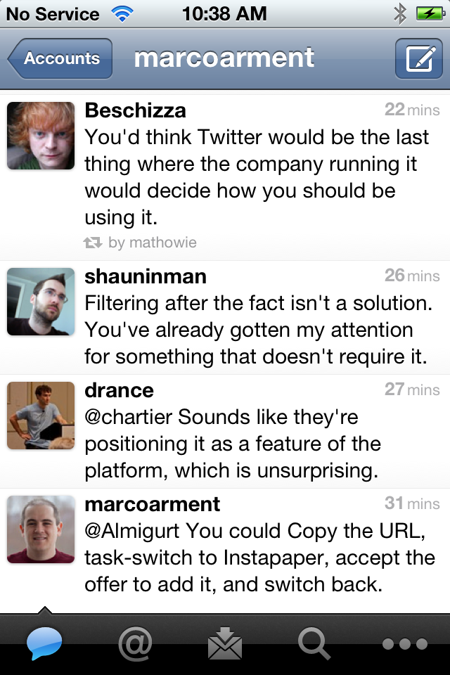
This is approximately in line with other good Twitter clients:
Twitterrific (left) with “Small” font, Tweetbot
But I’m really going to miss Tweetie’s wider text lines (along with many of its other great features, implementations, and design choices). On such a narrow screen, line width has a strong correlation to readability, and I think the other clients and Twitter 4.0 have gone in the wrong direction.
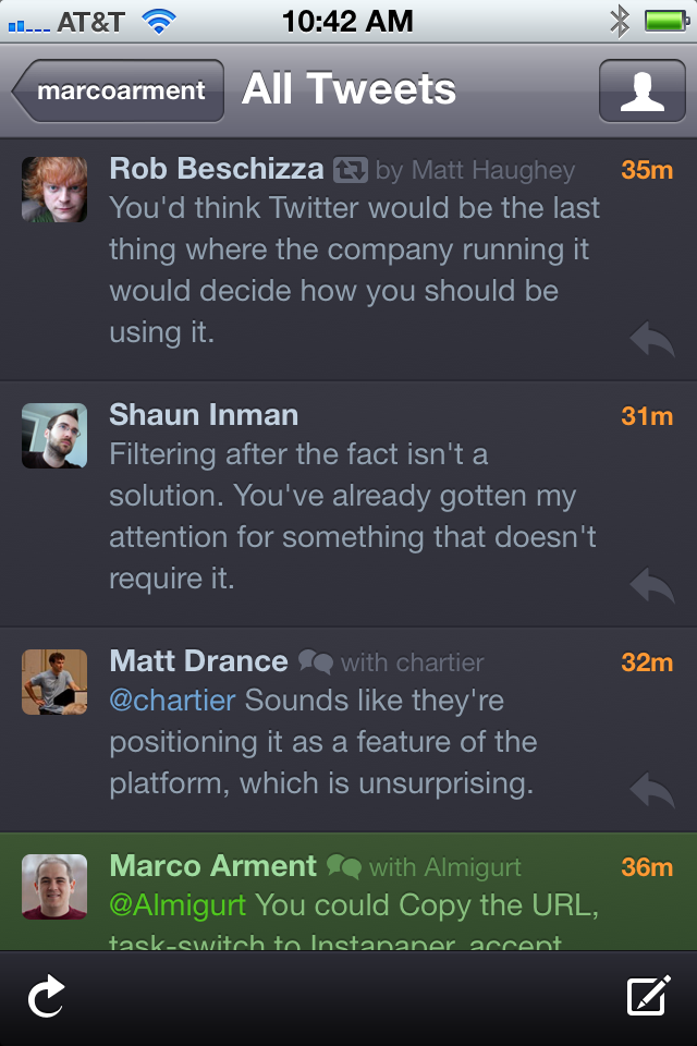
I put a lot of thought and experimentation into Instapaper’s default iPhone margin width, and I really think 10 pixels is ideal:
Instapaper 4.0 (left), Mail
The similarity to Apple’s own Mail app is probably not a coincidence. I look at Mail a lot — it’s the most-used app on my iPhone by far — and whenever I’m stuck and can’t decide how an interface or navigation element should work, I always look at Mail for guidance.
And in the past, I’ve always looked at Tweetie.
Tweetie was always a shining example — the best on iOS, I’d say — of making a very feature-rich, well-designed app that could (and did) win an Apple Design Award, but also didn’t go overboard with textures and reimplement too many standard UIKit controls and conventions.1 It proved that while good design often contains heavy graphical flourish, it doesn’t require it.
But now it’s gone. I’m sad not just for the loss of the second-most-used app on my iPhone, but also the style it exemplified — a style that I’ve always tried to create in my app, and by far the style that I prefer in other apps.
This isn’t a dig at Tweetbot, but pointing out a general trend: iOS apps that win ADAs tend to use textures and custom controls much more heavily than Tweetie. ↩︎
MG Siegler, reacting to Crothers’ content-free linkbait, clarifies the difference between a blind-faith “fanboy” (which Crothers would definitely classify me as) and a sensible buyer:
I’m a fan of Apple’s work because it’s great. I suspect my peers he would criticize would say the same thing. I’ve been a fan of Apple’s products for about 6 years now. Before that, I didn’t own one. You could even say that I hated Apple products back in the 1990s when I was going to midnight launches of Microsoft products. Why did that change? It’s not some spell or some bullshit marketing. It’s all the hard work and attention to detail Apple put into their products during the second Jobs reign. I wanted the best, Apple made the best.
If Apple’s products start slipping again, I’ll drop them again. The loyalty isn’t to some magical unicorn tear voodoo — it’s to the best products.
Bingo.
I bought my first Mac in 2004 when I graduated1 from college and needed my first laptop.2 I did the research and looked at a bunch of laptops, and I ended up liking the PowerBook best. Before that, I was a die-hard Windows guy.
Apple’s customers often get accused of unconditional devotion to the company’s products. But the accusers often have an equally irrational aversion: they blindly and universally won’t buy Apple products. People can buy (or not buy) whatever they want, but if a few hundred million people think Apple’s products are good and fit their needs, and a handful of tech bloggers loudly refuse to buy them even if they have similar needs, which side looks like the irrational one?
Yes, my first laptop was in 2004. So was my first cellphone, a mediocre LG VX4500. The excellent Motorola E815 that replaced it the next year was my phone of choice until the iPhone. Even after my contract renewed and I got a discounted RAZR V3m, I hated it and quickly switched back to my E815. It had great cellular reception, great battery life, great build quality with nice big buttons and a very satisfying flip, and — get this — EVDO tethering via Bluetooth without a data plan (just using airtime minutes when connected). In 2005. It’s hard to beat that even today. ↩︎
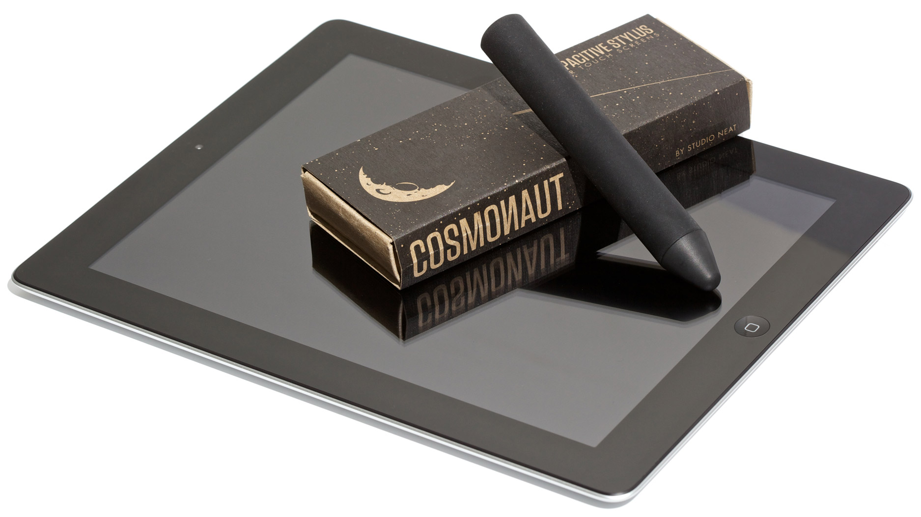
Studio Neat, known for the Glif iPhone stand, recently finished their second product: the Cosmonaut wide-grip stylus for “touchscreens”. They’re trying to be inclusive, but I think it’s obvious that this is designed for the iPad, so I photographed mine in its natural habitat:
The Cosmonaut was born out of our desire to have a really great stylus for our iPads. We love to sketch out quick ideas or doodle on our tablets, and using a stylus is much better than a finger for such tasks. We bought several different models currently available on the market but they all suffered the same problem: they were designed to look and feel like a pen. But why? Writing or drawing on the iPad feels nothing like using a pen or pencil. For one, tablets are ideal for low fidelity sketching. Also, it is pretty awkward to rest your palm on the screen of the device because it throws off the capacitive detection. Writing on a tablet feels like writing on a dry erase board: fast, simple, low fidelity. The perfect tablet stylus is one that feels like a dry erase marker.
I backed it on Kickstarter as soon as I saw it last spring (along with a lot of other people), and it’s finally here. Anyone can order one, starting today, for $25.
I’ve tried a lot of iPhone and iPad styli, and I haven’t liked any of them before. But this one’s very different.
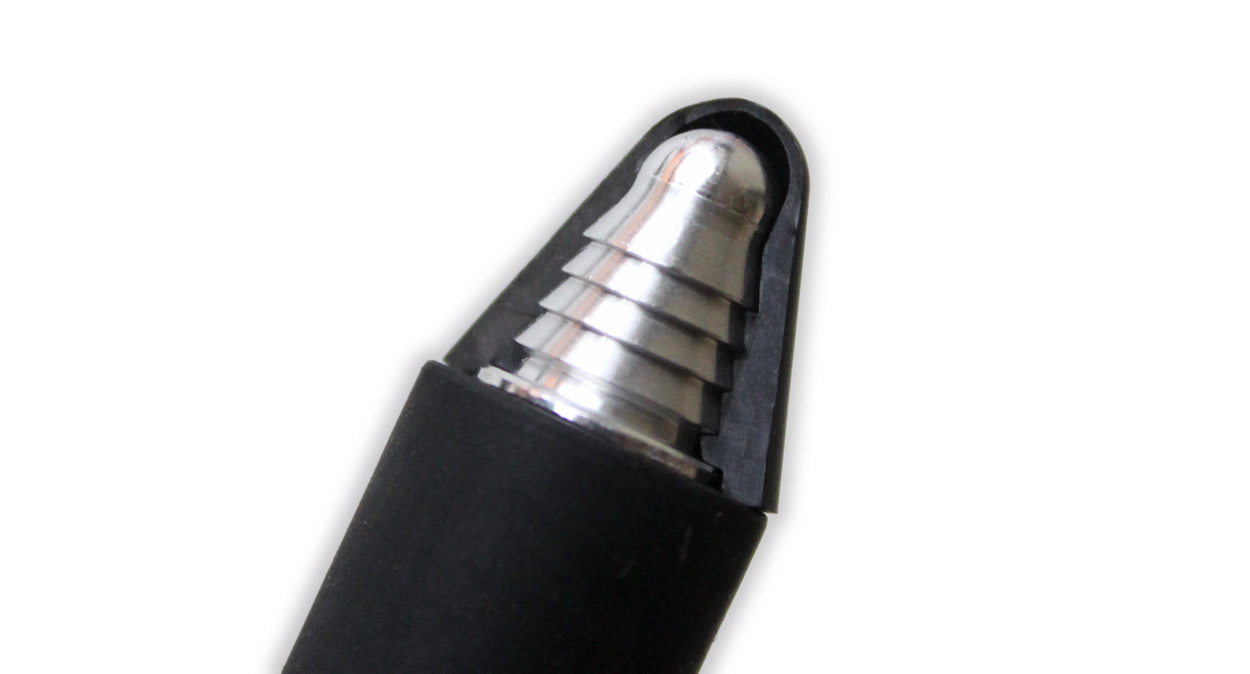
The capacitive screens on our favorite touch devices don’t respond to pressure, like old plastic-stylus PDAs. Instead, they can only detect a blob of electrically conductive material, like a human fingertip, being pushed against them.
The tips of most other capacitive-screen styli are little blocks of conductive foam. That arrangement sucks: it feels like writing with a sponge. And the little sponges are usually attached to too-short, too-lightweight barrels that just feel flimsy and unsatisfying.
The Cosmonaut is built completely differently, and it exudes quality.
There’s no foam anywhere in it. The soft rubber tip gives slightly when pushed, because there’s a small air pocket between it and the solid aluminum core. Here’s a cross-section photo:
Photo courtesy of Studio Neat, since I didn’t want to cut my Cosmonaut in half. See more construction details in their video.
It doesn’t feel like a brick of solid plastic writing on glass, and it doesn’t feel like a flimsy sponge on a stick. It feels like a marker, as designed.
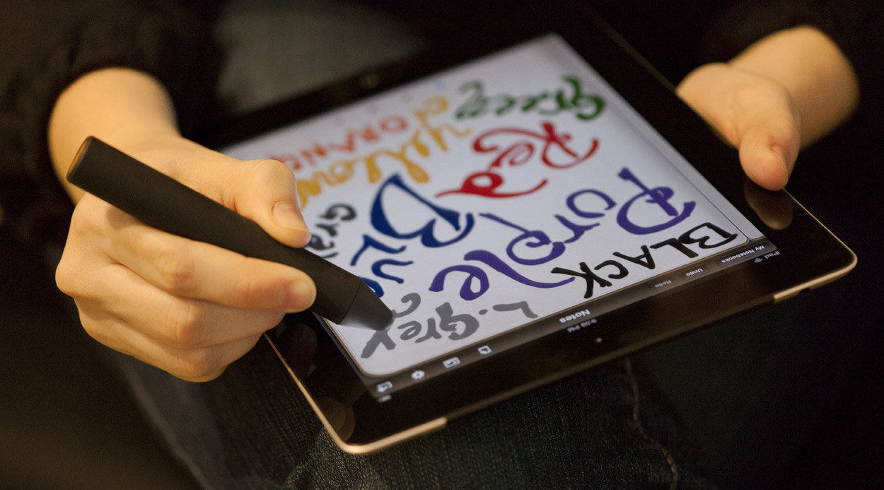
Writing with the Cosmonaut is satisfyingly firm and perfectly controlled, and it glides over the screen perfectly. I can’t really describe the gliding feel any better: it’s just perfect. When you use it for the first time, you’ll notice this immediately. (100% of the people in my household did.)
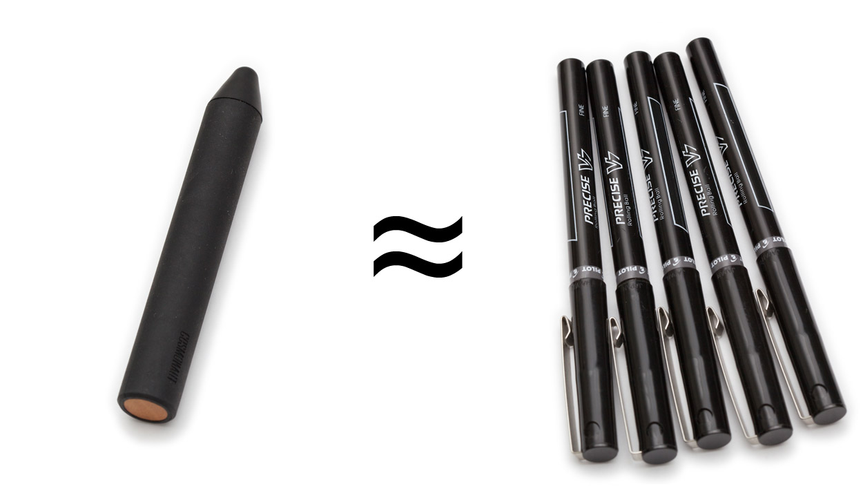
It’s noticeably heavy (45g), at about the same weight as five of these Pilot Precise V7 pens (49g):
The weight and thickness make it surprisingly easy and satisfying to manipulate. I have no trouble at all hitting tiny, precise touch targets very quickly even when I need to jump across the iPad’s screen to get there. But after a long doodle, I felt slightly fatigued, possibly because of the weight. (Someone who uses pens more than I do probably wouldn’t have this problem.)
Most styli with the traditional shape encourage you to hold them the same way you’d hold a pen: firmly and close to the tip. This often causes your hand to inadvertently rest on the screen, confusing the input to the app and often resulting in errors. The Cosmonaut’s size and shape encourage you to hold it the same way you’d hold a dry-erase marker when writing on a whiteboard: further up the barrel, with a loose grip, and with your hand floating far above the screen. I’ve never found myself accidentally resting my hand on the screen when using the Cosmonaut.
This is definitely for tablets only, as Studio Neat suggests. It technically works on the iPhone (and even my MacBook Pro’s touchpad), but it’s like using a big Sharpie on a Post-It note — there’s not enough space to do much, although you could use it in a pinch to operate an iPhone while wearing gloves. It works acceptably on the 7” Kindle Fire and Nook Tablet, but it really needs the space of the 10” iPad to shine for most uses.
So what are its uses?
I got to play with it for about ten minutes before my wife “borrowed” it. I didn’t see it again for an hour.
It’s just so damned fun.
The Cosmonaut is the only capacitive stylus I’ve wanted to use for more than thirty seconds. The others were novelties, but this is a truly useful tool. It’s excellent, and I’m going to start bringing it in my computer bag.
I’m not an artist, but I bet artists and doodlers will love it. It works amazingly well in Penultimate (pictured above).
I’m not a note-taker, but I bet note-takers will love it. It works very well with Note Taker HD, and MyScript Memo’s transcription is amazingly accurate.
I’m not a document annotator, but I bet… document annotators… will love it. (I don’t know. Someone’s buying those bazillion PDF-annotation apps.) I’ve already used mine to sign a PDF form in GoodReader.
And any Pictionary-like game would be a lot of fun with it.
But I think the best use of the Cosmonaut is exactly what Studio Neat intended: quick whiteboard-style sketching. That’s how I plan to use mine… once we’re done doodling in Penultimate.
Update, March 2012: The Cosmonaut is awesome with Draw Something on iPads.
The release of iBooks 1.5 offers an interesting swap out. My three least favorite fonts for reading on screen were removed: Baskerville, Cochin, and Verdana have been erased from the list. Only the dread Times New Roman remains alongside Georgia and Palatino. Added into the mix are four other faces: Athelas, Charter, Iowan, and Seravek. Only one of these I was familiar with.
The screenshots of the new fonts are a nice touch. I like reading with Verdana at small sizes on the iPhone, but maybe I could replace Baskerville in Instapaper with one of those nicer serifs.
What’s most interesting about this is how incredibly poor the stock security is, and how so much of the Kindle Touch’s very slow interface is HTML and Javascript. I’m curious how deeply the web technologies are integrated, and whether they’re responsible for the poor performance relative to the older OS on the Kindle 4 (which is mostly unchanged from the Kindle 3).
Thanks to OmniFocus for sponsoring the RSS feed this week.
You have goals — use OmniFocus to reconstruct fragments of ideas or projects into actionable steps to complete those goals.
Move the responsibility of remembering daily tasks from your brain to OmniFocus — gather everything into the Inbox for later review, and then organize those bits into folders, projects, actions, and contexts.
OmniFocus is as simple or advanced as you decide to make it, and available on Mac, iPad, and iPhone with free cloud sync. Move past mere task management and get things done with precision.
The trauma we’re experiencing right now resembles the trauma we experienced 80 years ago, during the Great Depression, and it has been brought on by an analogous set of circumstances. Then, as now, we faced a breakdown of the banking system. But then, as now, the breakdown of the banking system was in part a consequence of deeper problems. Even if we correctly respond to the trauma—the failures of the financial sector—it will take a decade or more to achieve full recovery. Under the best of conditions, we will endure a Long Slump. If we respond incorrectly, as we have been, the Long Slump will last even longer, and the parallel with the Depression will take on a tragic new dimension.
To give your Instapaper account a boost for the holidays, here’s a hand-picked selection of great 2011 stories from the editor of Give Me Something To Read, Richard Dunlop-Walters.
(He’s British and may or may not own a monocle, so you know he has good taste in writing.)
It’s important to stress though that being an alpha release; it is not complete. It has reached a point where it may suit some early adopters and provide some relief to those who have been questioning TextMate’s future.
It really happened.
My doubt that this day would ever come is one of those things that I’m very glad to be proven wrong about.
Louis CK produced a comedy special on his own dime, put it up for sale on his website as a DRM-free video download for just $5, and made enough to cover his costs and consider it a success:
It’s been a really fun and intense few days. This video was paid for by people who bought tickets, and then bought by people who wanted to see that same show. I got to do exactly the show I wanted, and exactly the show you wanted.
We wanted to ensure that HP maximized its opportunities to connect with people, to tell great stories and inspire great stories, to listen and respond, and to adapt to its environment.
HP definitely has its problems, but this is just a coat of paint. Changing the logo to some diagonal lines is only going to represent something meaningful if HP changes its products and actions more deeply.
Update: HP claims that they’re not planning to use the proposed new logo.
Amazon issued a press release touting Kindle sales numbers yesterday:
Amazon.com today announced that Kindle devices remain the hottest products this holiday season – for the third week in a row, customers are purchasing well over 1 million Kindle devices per week, and Kindle Fire remains the #1 bestselling, most gifted, and most wished for product across the millions of items available on Amazon.com since its introduction 11 weeks ago.
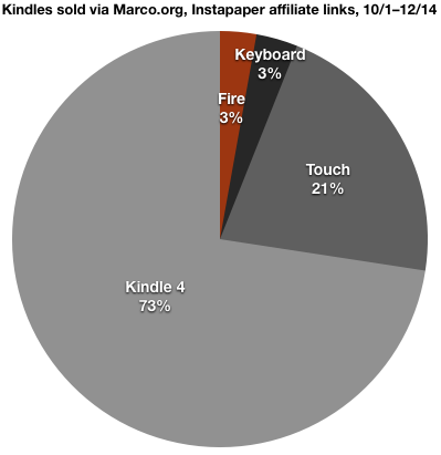
I have my own window into a tiny slice of Kindle sales, since Instapaper’s site has some moderately used Kindle-buying affiliate links, and my Marco.org reviews of e-ink Kindles (which also contain affiliate links) get a lot of Google search traffic and seem to influence some people’s decisions. And my little window definitely doesn’t represent Amazon’s total sales:
This is the combination of all models within each family (with or without 3G, with or without ads).
Among model families with “Special Offers” ad subsidies available (Kindle 4, Touch, Touch 3G, Keyboard 3G), 55% of these buyers chose to take the lower price with the ads.
Among model families with 3G options (Keyboard, Touch), 30% of buyers chose 3G. But that’s only 7% of total Kindles represented here.
The total sample size is over 200 Kindles. This is far more than these links have ever generated in such a timeframe — I can see that Amazon is definitely selling a lot more Kindles than usual.
Obviously, my numbers don’t line up with Amazon’s, since they claim that the Kindle Fire is the top seller. But I panned the Fire, was lukewarm on the Touch, and recommended the Kindle 4. And on Instapaper’s Kindle page, I labeled the Kindle 4 as the “recommended model”. So my proportions, especially how poorly the Fire is doing, only indicate that people using these affiliate links are listening to my recommendations, not that this is a remotely accurate representation of all Kindle buyers.
But I’m curious if the Amazon’s claim that the Fire is the top seller depends on any non-obvious technicalities, such as the distinction between ad-subsidized and full-price models within each family, or the distinction between 3G models. Every combination of ads, no ads, 3G, and no 3G shows up separately in the affiliate reports, and I have to imagine that they’re separate throughout all of Amazon’s internal stats.
I hope, for the sake of honesty, that Amazon’s claim about the Fire’s dominance is based on combined model-family numbers: that is, I expect from their press release, assuming the basic Kindle 4 with ads is the second-best-selling model, that the Fire is beating the combined Kindle 4 family (with and without ads), not just the one with ads.
Where Marco sees a huge lean towards the Kindle 4 (the device that he recommended), I see a huge lean towards the Kindle Touch (the device that I recommended). But we are both seeing that the Fire is a poor seller comparatively.
Shawn confirmed my suspicion that my Kindle affiliate sales numbers are more due to the context they’re in, and my recommendations around them, than any bigger indicator of Amazon’s total sales.
Also worth noting: My Kindle Fire review didn’t contain an affiliate link to purchase it. It didn’t seem right to say I wouldn’t recommend that people buy the Fire and then offer them a link to buy it.1
I think the most interesting general-purpose takeaways from my data yesterday were:
55% of buyers from my links choose the “Special Offers” ad-discounted Kindles.
Many people follow recommendations made in online reviews — we are making a difference.
I have Fire affiliate links on Instapaper’s Extras and Kindle Settings pages, since I list every model there. ↩︎
Dieter Bohn at The Verge reports that the Fire has a system-level component that intercepts and redirects all requests to market.android.com:
That method means that even if you disable Amazon’s Silk cloud proxy server or go through the extra step to install a third party browser like Dolphin, this little file will redirect your requests to Amazon’s own store.
The Kindle Fire’s top priority is selling Amazon’s content. Everything else is secondary.
Yet here we are with a group of elected officials openly supporting a bill they can’t explain, and having the temerity to suggest there’s no need to “bring in the nerds” to suss out what’s actually on it.
Widespread anti-intellectualism scares the shit out of me.
Via Jim Dalrymple. This works out incredibly well for RIM: the truckload of presumably unsold PlayBook inventory is probably worth more to them stolen and reimbursed by insurance than sitting in a warehouse dragging down the company’s financials.1
How convenient. Someone should steal their entire PlayBook inventory.
Should the stolen truckload count toward the PlayBook’s marketshare? ↩︎
Remember when Michael Arrington was going to release the CrunchPad, a 12” tablet for $200?
Then remember when the hardware company doing all of the work realized they didn’t need his support, went out on their own, and produced the JooJoo, a $500 tablet that a few hundred people were excited about for a few weeks before the much better iPad was announced at the same price?
Then remember when the JooJoo was finally shipped to the 90 people who still wanted one before it was officially abandoned seven months later?
Then remember last August, when the company announced that they were releasing a new Grid 10 tablet based on a forked version of Android with a custom interface that got awful reviews, but apparently some people preordered it anyway?
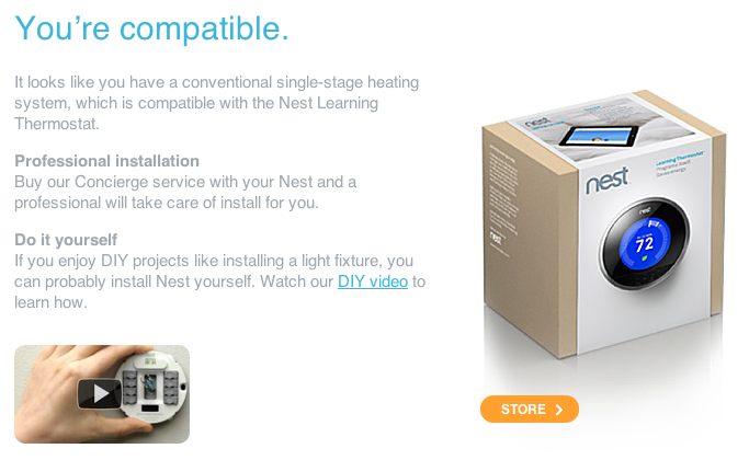
We’ve had two Nest thermostats for a few weeks now, and we mostly like them. But I’ve run into an issue with our wiring that Nest has all but confirmed, and I’ll need to either stop using the Nests or run new thermostat wiring.
Nest claims to be compatible with single-stage systems with two (heat only) or four (heat and air conditioning) wires:
R or Rh: 24V AC supply for heat signal
W: Call for heat
Rc: 24V AC supply for air conditioning signal
Y: Call for cooling
When a thermostat calls for heating or air conditioning, it bridges the respective R supply wire to the call wire and the equipment turns on. Simple. (Thanks, Transwiki thermostat wiring page.)
This setup doesn’t provide any method for the thermostat to take power for itself from the system when the heat or air conditioning isn’t on: the only way is to draw some current off of the bridged circuits when they’re running, but they might not run often enough to keep a digital thermostat powered. That’s why most digital thermostats need replaceable batteries.
Another standard thermostat wire is often employed to solve this problem:
C: 24V AC return that does nothing. A digital thermostat can use the R-C circuit to charge itself as needed without triggering heat or air conditioning.
The Nest uses a built-in, permanent, rechargeable battery that automatically draws current from the system to charge itself. It claims to be compatible with systems that have this wiring arrangement even if they lack the C wire.
The problem arises when the Nest needs to charge itself and neither the heat nor air conditioning has turned on in a while, like on a mild day. Without a C circuit to take power from, it can only charge itself from running the system.
So it pulses the R-W heat circuit in short bursts to get power.
Maybe some systems are slow to respond to the call for heat, so this doesn’t result in anything noticeable. But my boiler reacts instantly, and it sounds like it’s really not enjoying this technique:
I’m not an expert, but I have to imagine that this is not good for my boiler’s longevity. And the noise it makes is annoying at best.
I emailed Nest support and they essentially confirmed that this is how it behaves, so it doesn’t appear to be a bug in mine. They recommended installing a C wire to solve the problem, which will require an electrician and, therefore, more money. I’m going to look into how much that will cost and decide what to do then.
But Nest shouldn’t claim compatibility with systems without a C wire. Their solution of pulsing the heat circuit clearly doesn’t work on all systems without significant negative side effects.
It’s either going to be an extremely busy June for Google — or an extremely busy June for Google’s PR department when Google fulfills none of Schmidt’s promises.
Don’t worry, nobody in the tech press ever remember’s Google’s promises. Remember, this is the advertising company that does no evil and the company that bends to cellular carriers’ wishes to lock down Android at every turn… but it’s “open”!
Amazon published this Kindle Fire vs. iPad 2 page shortly after its announcement on September 28, 2011. I thought it was just a temporary promo, but it turns out that Amazon is still pushing it heavily.
It’s interesting that the quotes under “What People Are Saying” aren’t linked to their sources (Gizmodo, Extreme Tech, Ars Technica, Forbes/Mobiledia). Maybe it’s because all of them are simply reactions to the Fire’s specs and price after the announcement, not reviews from anyone who actually used one. By those standards, I could have been quoted along with them that day:
“The Fire will be the first Android-powered tablet to sell in meaningful volume… It’s definitely going to compete with the iPad” — Marco.org
Why hasn’t Amazon updated the page with actual reviews since the Fire’s launch? Surely they can find some positive ones.
Anyway, the main attraction of Amazon’s Kindle Fire vs. iPad 2 page is the big comparison table. Other people’s feature-comparison checklists always leave out factors that are important to me, so I made my own additions that Amazon is welcome to include on their page:
Price
$199
$300 less than iPad 2
$499
Volume Buttons
No
Yes
Stability
Needs Improvement
Very Stable
Home Screen
Frustrating
That was a small swipe. Did you mean to tap? Try again
Easy
Tap an app to open it
Magazine Reading
Infuriatingly Awful
Pretty Good
Netflix
Poor
No HD, no complete full-screen viewing, poor stability, and no convenient way to adjust the volume during playback
Very Good
HD-quality streams, stable app, volume adjustable via convenient buttons
Available Apps
Not A Lot
And mostly crap
A Lot
Critically acclaimed apps and award-winning games
Web Browsing Speed
Amazon Says It’s Faster
Reviewers disagree
Everyone Else Says It’s Faster
They must be fanboys
Overall Speed
Frustratingly Sluggish
Very Fast
Syncing Music And Videos From Your Computer
Only Manually
And 6 GB is really small
Automatically with iTunes
16–64 GB sizes available
Available Cases And Accessories
Very Few
Tons
3G Data
Not Available
Isn’t everyone always on a Wi-Fi network?
Available
$129 extra plus $15/month for 3G service
Automatic Shutoff Feature
Yes
Sleeps automatically when idle or if you rest the bottom edge on a table or your pants or pretty much anything
Yes
Sleeps automatically when idle or when a supporting case is closed
Your Kids Can Charge Whatever They Want To Your Credit Card
Thanks to OmniFocus for sponsoring the Marco.org RSS feed this week:
We’re hoping you decided to check out the trial of OmniFocus after our sponsorship earlier this month. Here’s a quick 5-step jumpstart.
Capture everything. Take 15 minutes to move things out of your head and in to OmniFocus. Anything from long-term goals (earn pilots license) to quick errands (card for mother).
Define next actions. “Earn pilots license” deserves its own project. Move it to your library and decide what to do next.
Organize actions with contexts. “Research area flight schools” might be assigned to a Mac context for googling, “card for mother” to Walgreen’s.
Now we do stuff. If you’re at the office, focus on work projects to get stuff done!
Review mode. Take time to consider each active project. Does it need some work?
Find out more about OmniFocus here, and don’t hesitate to ask questions.
This is good news if you buy TV series on iTunes: now, you can try one or two episodes of a new season or series before committing to the full season, without worrying that you’re “wasting” what you spend on the first episode or two.
It always feels like there’s a comedian willing to address contemporary concerns with insight and honesty for each moment in time. All the greats had their focus: Richard Pryor and Chris Rock had race, George Carlin had absurdity, and I think Louis has hit on some sort of subterranean undercurrent of emotion that I didn’t realize might be swelling until I listened more closely: shame.
David Pogue at the New York Times on the Kindle Fire 6.2.1 software update:
Sure enough: the home screen “carousel,” a rotating shelf that holds all of your books, magazines and movies, now stops on a dime when you want it to. It takes only one tap to open something instead of several frustrating ones. When you do tap something, it opens faster and more fluidly. Page turns are smoother, especially in magazines.
I’ve only played with the update for a few minutes, but it does feel faster. The Fire still has a lot of other problems, many of which can’t be fixed by software, but at least Amazon is working on it — historically, Kindles have received very few software updates over their lifetimes.
Matt Gemmell gives a great overview of the AllThis sleaziness. (And don’t miss Joel Housman’s.)
I’m very conservative about endorsements and promises of my time, and I’d never agree to participate in something like AllThis. To have them spamming Twitter with my name and promising people my time is fraudulent, malicious, and deeply offensive.
Ray Wert at Jalopnik on the North American Truck of the Year award:
Right now, however, whatever criteria the committee does use doesn’t seem to make sense. More to the point, if there aren’t any good trucks, then just don’t give an award, OK?
This award, which needs to be given to a compact SUV because “there weren’t any new or substantially changed trucks introduced this year”, is a great example of an unhelpful-to-consumers review like Ben and MG have talked about.
If I heard about the “North American Truck of the Year” from any manufacturer’s marketing materials, I’d probably assume that some prominent industry publication looked at all of the trucks available in North America this year and picked the one they thought was generally the best. In fact, they’re only picking the best out of new or redesigned models, so they’re reducing the eligibility pool down to very few models — and models that wouldn’t fit many people’s needs who are looking for a “truck”.
The tech industry is no stranger to this type of narrow back-patting and the dysfunction that results.
The iPhone App Store generates about four times the revenue that is generated by the Google Android Market, the report finds, in terms of total revenue generated by the 200 highest grossing apps. Meanwhile, the App Store for iPad generates more than double the revenue of the Android Market.
Developers target iOS first, and often exclusively, because we’re fanboys.
The search giant will pay just under $300 million per year to be the default choice in Mozilla’s Firefox browser, a huge jump from its previous arrangement, due to competing interest from both Yahoo and Microsoft.
Oh, Mr. Romney will probably be called on some falsehoods. But, if past experience is any guide, most of the news media will feel as though their reporting must be “balanced,” which means that every time they point out that a Republican lied they have to match it with a comparable accusation against a Democrat — even if what the Democrat said was actually true or, at worst, a minor misstatement.
The least-informed voters tend to be those who get their information primarily from TV “news”.
Matthew Panzarino at The Next Web on Samsung’s refusal to issue Android 4.0 updates to its one-year-old devices:
The problem isn’t Samsung, it’s systemic to Android as a whole. The makers of Android hardware see little benefit in updating even devices that are less than a year old. And, though I think it’s a punk move, I don’t blame them. There is little to no return to be had.
Nobody in the Android ecosystem — not Google, not manufacturers of Android devices, and certainly not the gadget blogs that review and promote them — seems to care about long-term user satisfaction, even when “long-term” is as short as a two-year smartphone contract.
Rich people and gadget bloggers can upgrade their smartphones every 6 months, but what about everyone else? Will most of Android’s userbase feel much loyalty to the platform at their next contract renewal?
And what about tablets, which should probably be expected to have a useful life closer to a computer’s than a phone’s? The original iPad is nearly two years old, runs iOS 5 well, and will probably get a few more significant OS upgrades. The Galaxy Tab is one year old and it can’t run the latest version of Android.
Generally, open-backed (or “open”, or “open air”) headphones produce higher-quality sound at lower prices than closed-backed (“closed”) headphones, and all of the best-sounding high-end headphones are open.
But you probably shouldn’t buy open headphones. It’s irresponsible to discuss headphone recommendations without emphasizing the important distinction between open and closed, since most people aren’t familiar with how much this matters in practical use.
Open-backed headphones allow air to circulate, which is more comfortable. They also can help give the impression that sound is coming from around you, as opposed to emanating from your corpus callosum, which is a characteristic of closed-back and in-ear headphones. Closed-back models are better at sealing off the outside world, but your ears may get hot from the lack of air circulation.
That’s true, but “better at sealing off the outside world” needs to be expanded with a very important distinction.
Grobart’s right that open headphones, such as the entire Sennheiser 500-series and the great-sounding-but-uncomfortable Grado SR-60, do let a lot of outside noise in, so they’re terrible for blocking sound in loud environments.
But, critically, open headphones also let your music out. Even if you’re listening at a moderate volume, everyone in the room will hear a tinny, annoying version of your music. So open headphones are a poor choice for environments with people nearby, such as open offices, home use with anyone else in the room, airplanes, buses, or trains. (Don’t be that guy on the subway.)
That rules out a lot of the situations in which people use headphones. Therefore, generally, I don’t recommend open headphones. My best-sounding pair of headphones, the Beyerdynamic DT-880, is also my least-used because I’m hardly ever in my office alone and they’re too big to walk around with.
It’s also unfortunate that Grobart’s article didn’t even attempt to suggest some specific models as starting points. The article’s takeaway seems to be “do your own research”, but that’s not very helpful to average consumers facing the barrage of similar-looking models spanning huge price ranges from the high-end headphone brands.
So here’s where I think you should start:
Closed, non-portable headphones: Sennheiser HD 280 Pro. If you’re trying to block out sound to help you concentrate in a noisy office, your search can end right here. This is what you want. If I could only own one pair of headphones, it’d be either the 280 or the new higher-end 380.
The “non-portable” models are too big to walk around with. You can, but you’ll look odd, and you might need to wrangle a long, heavy, coiled cord. They’re fine for airplanes, though, if you’re willing to devote the carry-on space.
There’s a lot of Sennheisers on the list for good reason. I’ve had headphones from AKG, Grado, and Beyerdynamic that all sounded just as good (and sometimes better), but I’ve always found Sennheiser’s models to be more comfortable, practical, and durable.
Thanks to OmniGraffle for sponsoring the Marco.org RSS feed this week:
Creating in OmniGraffle: a five-step introduction attempt in less than 140 words.
Desired outcome: a new mockup of WebsiteThing.
Start it up. Download OmniGraffle here. Choose “Blank” from the template window.
Frame it. Stencils→Software→Konigi Wireframes. Designing for an iPhone? Drag out the iPhone browser. Lock object in place with ⌘+L.
Build it. Check out what else the Konigi stencil offers: position placeholders, buttons, and forms on your canvas. Turn on Snap to Grid (Arrange→Grid→Snap to Grid) for quick alignment.
Fine-tune it. Replace Konigi elements with real copy or graphics if ready. Add labels for the benefit of others.
Share it. Email, show off to colleagues via AirPlay, and more.
It’s all possible on the iPad, too. If you’d like, explore a bit more.
A surprisingly good show that you’ve probably never heard of, available on Netflix streaming. It only had 20 half-hour episodes, so it didn’t have enough time to get stretched out into too many seaons and start sucking.
Here’s exactly the kind of conflation Amazon wants: a headline referencing the “over 1 million Kindles per week in December” stat from Amazon PR in an article that only mentions the Kindle Fire, implying that Amazon has sold over 4 million Kindle Fires to date.
In fact, all Amazon has said is:
They’ve sold at least 4 million Kindles, total, this month.
The Kindle Fire is the top-selling model.
But the Kindle has between 5 and 10 models, depending on how Amazon counts them:
Kindle Fire, Kindle Touch 3G, Kindle Touch, Kindle 4, Kindle Keyboard 3G, Kindle DX (the most likely count, 6)
Kindle Fire, Kindle Touch 3G, Kindle Touch 3G with Special Offers, Kindle Touch, Kindle Touch with Special Offers, Kindle 4, Kindle 4 with Special Offers, Kindle Keyboard 3G, Kindle Keyboard 3G with Special Offers, Kindle DX
So all we can derive from Amazon’s numbers is that they’ve sold at least 400,001 Kindle Fires in December.
I disagree. Even if you’re OK with their support of SOPA, their sexist and tasteless commercials, and their elephant-killing CEO, they’re still a terrible registrar: their upselling is misleading, sneaky, and sleazy, their control panel is horrendously confusing, slow, and buggy (like the rest of their site), their DNS servers are unreliable and randomly ignore changes you make, their support is terrible, and they often block outbound transfers for no apparent reason. They don’t deserve “a break”.