The iPod Shuffle nicely fills the low-end, rugged, disposable segment. It’s only $49, and it would take a significant breakthrough to offer something like the current Nano ($149) anywhere near that price point.
It’s obvious from the last few revisions that Apple isn’t meaningfully interested in the Shuffle anymore, but it’s also probably selling well enough to keep in the lineup. I don’t think they’ll cancel it until they can sell a Nano at $79 or less, which seems unrealistic today.
The iPod Classic is a different story, though.
It’s 160 GB for $249. Without it, the largest-capacity iPod would be the 64 GB Touch at $399. At this week’s event, an iPod Touch update may increase the top capacity to 128 GB, which would be close enough to the Classic. An update may also decrease the cost of the Touch’s storage, but probably not by enough to approach the Classic’s price per gigabyte.
Like the Shuffle, the Classic has also been kept alive by component economics. The difference is that while there’s probably still large demand for a very small and very cheap audio player, there probably isn’t much demand for a bulky (by today’s standards) audio player with the highest capacity possible that can’t run apps or games.
The Classic is also slightly confusing in the product line, competing with the iPod Touch at the high end. A sale of the Touch is probably worth more to Apple than a sale of the Classic, so eliminating this competition at the high end should slightly boost sales of the Touch.
A lot of people suggest that the Classic sells well to DJs. That may be true. But how many DJs are there, how many of them use iPod Classics instead of laptops, and how many of those are buying new iPods on a regular basis?
Anecdotally, in all of our wedding shoots, we’ve seen a bunch of live bands and a lot of groomsmen with laptops, but very few DJs. Sure, we’re only seeing a small part of the DJ business, but I bet it’s reasonable to conclude that it’s on the decline. How much does Apple really need to care about such a tiny market that’s probably shrinking further?
I bet the Classic will be quietly removed from the lineup on Tuesday.
But I wouldn’t put a lot of money on that. Most of these reasons for its discontinuation have been true for years, and it’s still inexplicably here.
One of Android’s biggest problems is the lack of OS updates after each device is sold, since both the manufacturer and the carrier need to approve each update, and neither of them care much about dumping money into enhancing “old” phones.
In addition to the long-term customer satisfaction issues this causes,1 it’s also a potentially huge security risk: if a serious vulnerability is discovered in a released version of Android and Google issues a patch, vast numbers of phones in the marketplace might stay unpatched for weeks, months, or the rest of their service lifetimes.2
In this case, the problem is in HTC’s code, not Google’s. That’s probably worse: HTC is a hardware company that barely makes software, so they’re unlikely to have any mature process in place to create and deploy security patches quickly, and they’re unlikely to care about it as much as Google would.
This must bother Google immensely, and it’s probably one more reason why they want to (and should) “close” Android, prevent manufacturers and carriers from mucking around with low-level services, and take control of updates and deployment.
For the remaining Android customers whose long-term satisfaction hasn’t already been burned by poor battery life. ↩︎
Google narrowly dodged this fate with a less-severe issue by issuing a server-side fix, but very few vulnerabilities can be fixed that way. ↩︎
The Wall Street Journal outs a huge Sprint iPhone deal:
Mr. Hesse told the board the carrier would have to agree to purchase at least 30.5 million iPhones over the next four years—a commitment of $20 billion at current rates—whether or not it could find people to buy them, according to people familiar with the matter.
Also interesting:
The board ultimately signed off on what the company internally called the “Sony” project, concluding Sprint couldn’t compete otherwise. Directors figured, “How can we pass this up? We have to have it,” the person familiar with the matter said.
[…]
The lack of the iPhone is “the No. 1 reason customers leave or switch,” Mr. Hesse said at an industry conference last month.
I don’t think this is necessarily as fatal as a stylus in all cases, but the little close/”Clear” buttons in iOS 5’s Notification Center are far too small and easily missed.
Today’s podcast: developing for the old and new Kindles, HTC’s security vulnerability and Android’s problems deploying updates, iOS 5’s behavior with apps’ Documents and Caches directories, the sound of judgment, and how vagaries in App Review rules ultimately hurt customers.
Then, in a special After Dark on grill care and technique, Dan didn’t give me advice for grilling chicken on skewers.
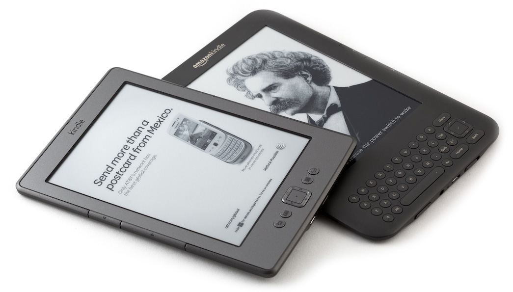
Every Kindle 1, Kindle 2, and 3G-equipped Kindle 3 was able to browse the web on its 3G connection for free, with no data plan, for the lifetime of the device — albeit with a very slow, clunky, minimally functional browser that took forever to operate and navigate.
With the Kindle Touch 3G, the only new Kindle with 3G available and likely the first e-ink device to have usable web browsing, this is no longer the case: only the Kindle Store and Wikipedia can be browsed over 3G.
This is perfectly reasonable given Amazon’s cost structure, but it’s a bit sad for Kindle geeks. I never used the 3G-web-browsing ability of my Kindles, but I always knew it would be there in a pinch. I bet most Kindle owners didn’t even know it was there.
I’m happy to see that the side page-turning buttons are improved from the Kindle 3. They’ve also used the same technique as the Nook Simple Touch when refreshing the screen: it only does the full “blink” on every sixth page-turn.
The new $791 Kindle looks like essentially a smaller, lighter Kindle 3 with a slightly improved screen, no keyboard, no audio hardware, better buttons, and a lower price. That’s not a bad deal at all.
I guess the gadget critics are disappointed by Apple’s iPhone event today, but I’m very happy with what was announced.
The iPhone 4 is awesome. In the last few months, since July when new iPhones usually come out, my iPhone 4 never felt old or slow. Even now, after the Apple event that usually causes such perceptions, it still doesn’t.
The iPhone 4S has a much faster CPU, a much faster GPU, a much better camera, a highly advanced voice-AI system like nobody has ever seen, better battery life, an improved antenna, international GSM roaming ability on CDMA-locked phones, a 64 GB option, and better carrier availability. It is extremely likely to become the best-selling smartphone in the world.
Would as many people be disappointed if Apple had released the same device but called it the iPhone 5?
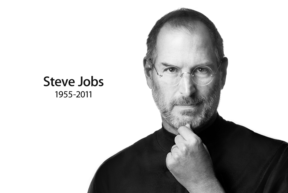
I didn’t know Steve. I never met him. I never worked for him. I never even got one of his famous one-liner email responses.
But it feels like someone close to me has died. He was so intimately involved in his company and its products (which have become critical parts of my career and hobby life), and he has publicly injected so much vision, personality, and care into our entire industry for so long, that I do feel like I knew him, even though I really didn’t.
So while I’m not qualified to write any sort of obituary, I feel moved to write this. It would be callous to keep writing about iPhone minutia without even acknowledging it.
Steve Jobs inspired generations of people to do great things. He certainly inspired me. He will be greatly missed.
I offer my most sincere condolences to his family, friends, and coworkers.
One of Jobs’s many gifts was that he knew what to give a shit about. He knew how to focus and prioritize his time and attention. Grass stains on his sneakers didn’t make the cut.
Walt Mossberg, in a great collection of personal anecdotes:
Earlier in the day, before Gates arrived, I did a solo onstage interview with Jobs, and asked him what it was like to be a major Windows developer, since Apple’s iTunes program was by then installed on hundreds of millions of Windows PCs.
He quipped: “It’s like giving a glass of ice water to someone in Hell.” When Gates later arrived and heard about the comment, he was, naturally, enraged, because my partner Kara Swisher and I had assured both men that we hoped to keep the joint session on a high plane.
In a pre-interview meeting, Gates said to Jobs: “So I guess I’m the representative from Hell.” Jobs merely handed Gates a cold bottle of water he was carrying. The tension was broken, and the interview was a triumph, with both men acting like statesmen.
Steve used my app. It was the best and the worst. Of course you want to hear that someone big and important and smart is watching what you’re doing, but there’s a second meaning to that kind of attention. He was watching my every move. It was highly unlikely that a some crappy bit of UI I made would result in an email from Steve, of course. But what did happen was, I installed a sort of innerSteve, an Angel of Better telling me to make it simpler, try once more, don’t forget to delight, and remember that greatness is possible.
Early this year, I got an email from an Apple executive who mentioned that he used Instapaper. I was surprised and flattered. I don’t know if Steve ever saw Instapaper, but knowing that this executive did made it a very real possibility.
But beyond the pride of knowing that at least one very important person at Apple used my app, I also became deeply embarrassed about the state it was in. Like Neven, I looked at it with a fresh critical eye, and I saw so many places in which I was sloppy or neglectful. (Damn, I hope they never saw the website.) With the 4.0 release due out next week, I’ve gutted and renovated many parts of the app that needed the most improvement, but I still have a long way to go before it’s where I want it to be.
I don’t even think it’s possible to be “done”. Great is never great enough. There’s always room for more improvement.
The inspiration of that culture in his company, and in our industry, is one of Steve’s greatest legacies. I’m pushing myself as much as possible to adopt that part of Steve’s work ethic and standards, because he sure as hell was never “done”.
New $79 Kindle with ads (left), Kindle 3 (right), asleep
Update, December: Many people have started calling this the Kindle 4, so now I will, too. Referring to it as “the $79 Kindle” as I wrote this seemed too prone to future confusion.
The lock screen shows a giant ad whenever the Kindle is off. Previous Kindles show tasteful pictures of classic authors when they’re off. There’s another ad banner at the bottom of the home (list) screen. You can get the ads removed for $30 more, either at the time of purchase or later from your Kindle management page.
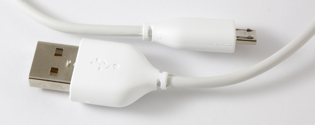
The USB cable in the box is thin, stiff, and cheap-feeling. Little bits of white plastic remain on the connectors’ mold seams.
The usual USB-to-AC power plug is missing. All previous Kindles came with it. If you want to charge this Kindle, you either need to plug it into a computer (which you’d never need to do otherwise) or spend an extra $9.99 for the power adapter.
The Kindle’s case is a silvery color, suggesting that it might be metal, but it’s all plastic with a semi-rubbery-feeling back, just like the Kindle 3.
In fact, the new Kindle is extremely similar to the Kindle 3 in many ways:
The CPU appears to be faster, but not by a lot.
The screen looks almost identical and responds at almost the same speed.
The bottom buttons and 5-way controller feel almost identical.
The menu system and interface are nearly identical. They also have the same text-adjustment controls.
The web browsers have the same capabilities and shortcomings.
The power button is still inconveniently on the bottom edge, although it’s now a pushbutton instead of a slider.
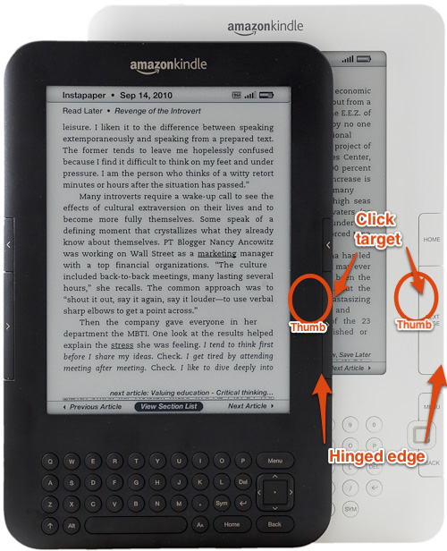
The page-turn buttons are also almost identical to the Kindle 3’s, which were a massive downgrade from the Kindle 2’s. On this photo of the 3 and 2, I’ve marked where my thumb goes when holding them, with the bottom-right corner of the Kindle resting in my palm:
Kindle 3, Kindle 2
The new Kindle’s page-turn buttons are almost identical to those on the Kindle 3. They’re slightly deeper around the side, but they feel almost the same as the Kindle 3’s in use, which is passable but not good. The major flaw in both is the uncomfortable way you need to rock your thumb to push the next-page button, since it hinges toward the outside edge. The Kindle 2’s buttons hinged toward the inside, so you didn’t need to try to wrap your thumb around the edge of the Kindle while simultaneously holding the Kindle with its pressure.
The new e-ink screen doesn’t require a full white-black-white “blink” cycle on every page-turn. Instead, like the Nook Simple Touch, it only does a full blink on every sixth page-turn. The problem with this technique is evident when you see why all previous Kindles blinked for every page:
Fresh text after a blink
Text after five non-blinking page-turns: note the degredation and ghosting from previous pages
E-ink pixels are made of a bunch of capsules, and inside each are a bunch of tiny pigmented microcapsules that are pulled around by electrical charges to form an all-black or all-white surface.
But sometimes the microcapsules don’t all move the first time they’re asked, and artifacts remain until the next time the capsule is asked to change its color. The full-screen blinks cycle the pixels enough times that you see much better contrast and less ghosting in the resulting page.
This new method assumes that you won’t mind these artifacts up to about five lazy page-turns worth, and you’ll appreciate seeing fewer blinks, which I’m not sure is necessarily a good tradeoff. Most people stop noticing the blink within minutes of owning a Kindle, so I’m not sure this was a problem that really needed to be (partially) solved, especially at the cost of text quality.
I guess I’m not alone in doubting this change. Amazon has already issued a software update that adds an option to revert to the old-style behavior of blinking on every page-turn.
Another notable change with the new Kindle is that the binder-clip case-attaching holes are gone.1 Cases now need to attach with those annoying corner-bridging strips. But on a slim, light $79 device, are you really going to want to spend $30 or more on a case?
Fortunately, a cut-off DVD bubble envelope for less than $1 is still a great slipcase for the new Kindles, although you can probably go a size smaller for the new one. But you probably won’t even need a case most of the time.
As much as I can complain about the cheapness of this new Kindle, Amazon did deliver exactly what we’ve been asking for: a Kindle that’s smaller and lighter because it finally omitted the rarely-used keyboard and audio components. The new Kindle is effectively a very slightly updated Kindle 3 with those omissions.
But with all of the cost-cutting continued from the Kindle 3, it’s not surprising that nothing about the new Kindle screams quality.
The Kindle 1 and 2 felt like high-quality items, while the 3 and the new Kindle feel disposable. But they’re priced accordingly. The Kindle 1 was $400. This one’s $79 with ads.
Even the ads fit in more than I expected, because this doesn’t feel like a high-end device that commands respect, for better and for worse. Again, cheap, disposable.
Knowing that this new Kindle costs less than the cover for my Kindle 2 is freeing: I can just carry it around uncased and unprotected in a (large) pocket, use it anywhere, and not worry about damaging an expensive electronic item, because it’s not. And it’s so inexpensive that I have no hesitation recommending it to pretty much anyone who ever reads books, because I know that if they end up disliking it or not using it much, it wasn’t a lot of money.
This is exactly what Amazon wants: cheap, ubiquitous devices that run their digital media stores. Because while most people focus on the purchase price, buying a Kindle is a lot like buying a game console: it’s not very useful until you spend more money feeding it with content, and Amazon takes a cut of all content sales.
Amazon’s content availability still blows away its competitors. Other e-readers might have a hardware or pricing advantage here or there, but you’ll regret purchasing an alternative the first time a book isn’t available there but is available for Kindle, which happens a lot.
Honestly, once I got into what I was reading, I forgot about the cheap, crappy page-turn buttons and the tacky ads on the sleep screen. Even the distorted unblinked text isn’t very noticeable when you’re engrossed in a book.
And therein lies Amazon’s true genius with the relentless pace of making the Kindles cheaper in both price and quality: they know that once you’re reading, minor hardware flaws are quickly forgotten.
So if you’re interested in reading books on e-ink, consider the new low-end Kindle. It’s not a high-quality device, but it’s also a very small risk to take. Buy it here and I’ll get a few bucks. (Thanks.)
But if you already have a Kindle 3 and are considering upgrading, it’s probably not worth it. It’s smaller, but is otherwise nearly identical.
If you’re less price-sensitive and aren’t in a rush, it might be worth waiting to see if the Kindle Touch or Kindle Fire, due out in mid-November, are a better fit for you. I’ll be reviewing both of them as soon as I can.
As far as I can tell from the website, the Kindle Touch and Kindle Fire also both lack the binder-clip holes. Their respective cases appear to attach by clamping around the entire device. ↩︎
Amit Gupta, founder of Photojojo, is a ridiculously nice person. I don’t know him, really, but we’ve had a number of small interactions and every time I come away wishing that I could be as genuinely and consistently pleasant, positive, and kind as he is.
He has just been diagnosed with leukemia. He needs a bone marrow donation from someone of South Asian heritage (India, Pakistan, Bangladesh, Nepal, Bhutan, Maldives, or Sri Lanka), but compatible donors are severely underrepresented in the national registry. If you might be a match, please get tested and get in touch.
…the twittersphere is lighting up with expressions of support.
But the support he really needs is for you to get a Q-tip, stick it in your cheek and mail it back. The process is free and you can sign up right here.
And Seth has generously put up quite a bounty:
Here’s the deal: if you are a match for Amit and the marrow donation happens, I’ll profile you or the project of your choice on the blog and send you a check for $10,000 for you or the charity of your choice.
(This is U.S.-specific because it’s where I know the carriers. Sorry, rest of the world. You probably have better options and more progressive locking regulations.)
Pick the carrier that’s best for you. It’s that simple.
Even though everyone else complains about AT&T, Verizon and Sprint both serve my area poorly. Verizon phones can’t place calls in my house, and my AT&T iPhone can. Verizon’s data service is barely usable on my commuter trains, and AT&T’s works acceptably. Sprint’s coverage here is worse than Verizon’s. So this is an easy decision for me: I’m sticking with AT&T.
If they all cover your area similarly, it more of a toss-up. Under ideal conditions, AT&T has the best data speeds and Verizon has the best voice quality, but almost nowhere actually provides ideal conditions, so it really depends on which carrier sucks the least in your area.
All three carriers’ plans are priced in the same ballpark.
People often say that Verizon covers fringe areas better, but in my experience, AT&T is comparable — sometimes one works and the other doesn’t, but neither more often than the other.
I don’t have much experience with Sprint, but the little I’ve had suggests that it doesn’t quite provide the coverage and strength that Verizon and AT&T do. Sprint phones can roam on Verizon’s network if there’s absolutely no Sprint signal, but in practice, that doesn’t happen often, and the phones will prefer a weak Sprint signal to a strong Verizon signal.
Sprint is the only carrier offering “unlimited” data.
Verizon messes with your data uncomfortably — they recompress JPEGs to save bandwidth, and they watch the sites you visit to collect (and presumably sell) the aggregate stats.
Doesn’t the iPhone 4S work on any carrier since it has CDMA and GSM?
Not quite the way you probably want.
The iPhone 4S is a “world phone”: every model has both CDMA and GSM radios. But, importantly, any iPhone 4S you buy in the U.S. with a contract at a subsidized price (less than $649) is still carrier-locked. You can’t change carriers later.
So even though it has both radios, an AT&T-subsidized iPhone 4S can’t later be used on Verizon or Sprint, and vice versa.1
What about the unlocked ones?
Starting in November, Apple will sell an unlocked iPhone 4S that works on any GSM carrier with no contract and can switch carriers, but there are two big downsides:
It only works on GSM carriers (and apparently only AT&T in the U.S.). It doesn’t support Verizon, Sprint, or T-Mobile U.S.
You’ll need to pay the full unsubsidized price, so add $450 to the advertised prices. The 16 GB model is $649.
The math makes the unlocked model a pretty poor deal for most people, unless you plan to use AT&T in the U.S., travel internationally a lot, and want to swap SIMs abroad instead of using AT&T’s international roaming rates.
You don’t get a discount on service by not taking the subsidy.
For mostly domestic use, even if you’re unsure about staying on the same carrier for the next two years, it’s still probably cheaper to take that risk and pay the early termination fee if you do need to switch in the future.
Black or white?
That’s up to you. I like them both, but I like black better.
If in doubt, go to an Apple Store and play with them both. If there aren’t any iPhone 4S models on display, just compare the iPhone 4 colors — they’re the same design.
16, 32, or 64 GB?
I regret only getting the 16 GB iPhone 4 last year. I fill it up constantly, especially when shooting video. The camera in the iPhone 4S shoots even larger photos and videos, so I’m not going to make that mistake again.
I also always run into limits when trying to sync a meaningful amount of music, podcasts, and photos from my library.
So after two years of limiting myself to 16 GB, I’m done. I’m going to 64 GB.
64 GB might be overkill for you, and it might not be worth the price. If you ever plan to shoot video, though, I’d strongly suggest getting at least the 32 GB model.
Preorder, phone store, or Apple Store?
Preorders have already started. If you can get one to ship in a reasonable amount of time, feel free to do it.
If you want to get one on launch day and the preorders are all giving long delays, don’t bother going to your local phone store: they usually have very few in stock until they’re plentiful everywhere. The most stock at launch is always at the Apple Stores. Go wait on the line if you want it on day one, and you’ll probably get one.
Good luck.
Technically, the iPhone hacking community has found ways to unlock iPhones, but it’s pretty difficult and risky, it doesn’t work on all models and all software versions, and it’s not something that most people will have access to. ↩︎
Part of this great piece by John Gruber is about the disappointment over the new iPhone’s screen size: Apple has probably decided that the iPhone’s 3.5” screen is the right size. They aren’t keeping it “small” because they can’t make it bigger, they just don’t think it should be bigger.
It’s interesting that the expectations by the geeks and gadget bloggers this time were so heavily in favor of a larger screen, and so much of the disappointment was because we didn’t get one. I don’t remember any noticeable disappointment in previous years about it.
As a four-year iPhone user, I’ve never thought, “You know what I don’t like about this phone? The screen’s too small. I’d like to reduce my battery life, and I’d like my phone to protrude from my pocket in a larger and more conspicuous rectangle, to achieve a larger screen that I cannot comfortably use one-handed. That would be completely worth it.”
Not once.
Android phones have been one-upping each other with screen size a lot recently. It’s an interesting tactic that seems to be working, at least relative to other Android phones. When comparing phones side-by-side in a store, the larger screens really do look more appealing, and I bet a lot of people don’t consider the practical downsides.
Screen size is an easy way for the commodity hardware manufacturers to differentiate their products. This is something they know how to do: checklist spec battles. Fragmentation isn’t a concern: Android hardware specs are already extremely fragmented, and the manufacturers couldn’t care less about such costs to the ecosystem anyway.
This has caused two interesting side effects that are probably accidental but work in Android’s favor:
The gadget bloggers accustomed to reviewing seventeen Android phones and one iPhone per year are now considering screen-size increases as must-have upgrades in each new device in a series, on par with faster processors and better cameras.
Any phone update that keeps the same screen size looks old and disappointing, like keeping the same CPU for two years in a row.
Some people who grow accustomed to large-screened Android phones are probably less likely to want to switch to an iPhone in the future, since they may view the smaller screen as a downgrade.
It’ll certainly be interesting if the latter is shown to be true in meaningful numbers.
But Android is finally getting more of its own identity. As John Gruber said in the aforelinked piece:
People who claim to be disappointed that Apple’s 2011 new iPhone doesn’t have a bigger display or LTE are effectively arguing that the iPhone should be more like Android. Whereas in truth, the iOS and Android platforms are growing more different over time, not less.
Android really is becoming much more differentiated from iOS. Flagship Android phones are looking less like iPhone knockoffs and more like, well, giant screens.
There are people who want that. But I don’t think it’s enough people that Apple should feel compelled to start competing for the largest screen size at the expense of other factors that are more important to Apple and its customers.
I think I might be the only person in the world who bought a box of Grape Nuts Flakes.
58 grams each of Grape Nuts Flakes (left) and real Grape Nuts (right). The Flakes are 220 calories and the original Grape Nuts are 200.
Grape Nuts are the Neo Geo of cereals: everyone knows one guy who likes them, usually an eccentric distant relative, but most people have never seen or tried them. And that’s for the best.
Most sane people don’t want their breakfast cereal to be gritty, bland, dense, and boring. They don’t want each spoonful of gravel to take an eternity to chew. They don’t want their jaws to feel sore after eating breakfast.
Grape Nuts come in a little box that weighs a ton and is always buried somewhere hard to find in the cereal aisle. On the back of my current Grape Nuts box, where most cereals put children’s games or at least something to read, Post has decided to share a meatloaf recipe (that naturally incorporates Grape Nuts).
But I must be weird, because I like Grape Nuts, along with very few other people.
Mixed with yeast (one cup per 2,000 pounds) and water, the flour turns to dough, gets chopped into 10-pound loaves and sent into a huge oven — 1,610 loaves at a time. “Now it gets interesting,” Mr. Vargas said at his workstation, watching the loaves emerge from the oven and catapult into the darkness. An instant later, they hit the fan — a whirling high-speed shredder that rips them to smithereens.
…
“It’s bread,” Mr. Vargas said.
The ingredient list is refreshingly short for a mass-market boxed cereal: whole grain wheat flour, malted barley flour, salt, dried yeast. It’s a recipe that’s been barely touched for 113 years.
But to make the Flakes, Post had to puff them up somehow and add sugar and vegetable oil.
The result is a disaster.
It’s not that the Flakes taste bad — rather, like Ocean’s Twelve, they’re bland, unmemorable, and a complete waste of a cereal-eating opportunity. After eating a bowl, I don’t feel full or even satisfied. Like most sugary flakes, I’d need a truckload of them (and their sugar, and their calories) to feel like I had a satisfactory breakfast, which is one of the reasons I stay away from most cereals and eat Grape Nuts in the first place.
Grape Nuts fans will think they’re too sweet and delicate. Normal human beings will think they’re bland, boring, and a waste of calories. If you’re going to eat Grape Nuts, there’s no substitute, and if you’re going to eat sugary flakes, you can do a lot better.
Harry McCracken’s great response to claims by Richard Stallman and Eric S. Raymond that Apple imprisons or tricks its customers:
Nope, sorry. People who use Apple products considered their options, and chose Apple. If they regret their decision, they can dump it at any time.
Die-hard anti-Apple people, increasingly becoming a dogmatic fringe, typically explain to themselves why a lot of people buy Apple products with the same few theories:
We have been brainwashed by “marketing” or Steve Jobs.
We are buying Apple products because they look good.
We are buying Apple products as status symbols to show off.
These blanket statements dismiss and discredit Apple’s customers, suggesting that we’re buying Apple products for irrational, invalid, or ignorant reasons.
But what these critics are increasingly showing is that they haven’t made any effort to understand Apple’s customers or the deficiencies in the alternative products that have given so many people rational, valid, intelligent reasons to buy Apple’s.
But [cancer] didn’t just rob Jobs. It robbed us too. That’s why people who haven’t met the man care so deeply. Not only is his early death a sad story, it takes away a man who will go down as one of the greatest innovators of not only our time, but of any time. And while you could certainly argue that someone like Michael Jackson contributed great art to the world — he did — he hadn’t done anything significant in nearly 20 years at the time of this death. Steve Jobs was in his prime when it came to his trade, when he passed away.
It’s both sad and frustrating to think about what we’re going to miss in terms of innovation over the next 20 years because Jobs won’t be here.
I’m skipping most Steve Jobs retrospectives and eulogies now because, frankly, I’m burnt out on the unexpectedly significant sadness that I feel about Steve’s death.
But even if you’re similarly burned out, this one’s worth reading.
Today’s podcast: Steve Jobs and Apple’s future, the iPhone 4S and hardware tradeoffs, how awesome smartphone cameras have transformed the way we use and buy cameras, the possibility of a Siri API, and the difficulty in finding good beta testers.
It is clear that for many of our members two websites would make things more difficult, so we are going to keep Netflix as one place to go for streaming and DVDs.
This means no change: one website, one account, one password… in other words, no Qwikster.
This is probably for the best, at least for now. Netflix can remain the place I go to watch movies (or to save recent movies I intend to watch when they come out on DVD) regardless of their available formats or outlets. Plus, Qwikster was a terrible name.
This isn’t the first time Netflix has backtracked on a significant change before it went into effect, but I think it’s the biggest.1
My best guess for the reason: the theoretical streaming-only “Netflix” service was going to lose far too many customers.
I’m sure Netflix will go streaming-only someday, and it’s good that its leadership is trying to get a head start on such a big transition. There are many advantages to ditching legacy technology a bit early. But this was simply far too early to attempt this move.
The Syndicate is a new ad network of technology, design, development, and business writers especially influential in the world of Apple. It’s a great way to advertise a new Mac, iPhone, or iPad app, or a product or service targeted at designers, developers, or consumers.
Please contact The Syndicate if you’re interested in purchasing an ad on the network.
To see your date, use the “Check your eligibility” links here.
This post on TheNextWeb seems to have the most information on how AT&T calculates eligibility dates for customers to upgrade to the iPhone 4S at the fully subsidized prices. Reader Julien Deveraux discovered:
“Tier 1 customers,” aka those who spend the most money per month (unlimited minutes + 2gb data + unlimited texts) are eligible every 12 months for early upgrade.
“Tier 2 customers,” aka [almost every subscriber,] who have either the 900 or the 450 minute plan but who still use the highest data plan and highest texting plan are eligible every 18 months.
“Tier 3 customers,” the ones who spend as little as possible and or the ones who’ve had late pays or service interruptions must wait the full 24 [months].
I’m one of the unlucky1 customers unknowingly in Tier 2 this year with the November 25 subsidy date. It’s the first year I haven’t been able to get the full subsidy on day one of the new iPhone. My rate plan hasn’t significantly changed in the last four years that I’ve been with AT&T, and I have a perfect payment history, so it looks like they raised the tier 1 boundary sometime in the last year.
I called AT&T today to see if they could move my date forward, and the rep (“Kevin”) was extremely helpful in calling around to various departments and even local store managers to see what they could do, but nobody could actually move my date, despite his opinion that I was one of their “best customers”.
I did learn a few things, though:
They supposedly can’t change the date in the eligibility system that Apple connects to, so I won’t be able to buy a fully subsidized iPhone 4S from an Apple Store until November 25.
AT&T’s Customer Relations department has some flexibility, but they’re facing the same 4- to 8-week shipping delay on the iPhone 4S, so it probably won’t save much time even if I could convince them. (But I couldn’t.)
AT&T store managers can override the eligibility date if it’s within 30 days, so if I can find an AT&T store with the iPhone 4S in stock, I can probably buy it there starting on October 26.
The official word is that they’re blaming Apple for this, saying Apple didn’t like their early subsidy changes in the past, but that sounds like bullshit or a miscommunication somewhere — Apple gets full price regardless. AT&T pays the subsidy.
I’d love to know the monthly-bill-price boundary to be a Tier 1 customer, but I can tell you that it’s almost certainly above the ~$80/month that I’ve spent for the last year. Knowing this number could make plan add-ons, such as tethering, more worthwhile.
I recognize how much of a first-world problem this is. ↩︎
It’s comical how the oldschool analysts like Gartner can’t bring themselves to call the iPad’s role in the market by any accurate name.
Are any other “media tablets” disrupting enough PC sales for anyone to notice? If not, isn’t it inaccurate at best to refer to a category generically when it only contains one product?
Ben Brooks’ criticism of Notification Center in iOS 5.
I agree with most of his criticism. I’ve been using iOS 5 on my main iPhone since WWDC, and I still haven’t really gotten the hang of Notification Center. It’s a major improvement over the previous stack of dialog boxes that you could never see again, but it’s still not a great solution.
And the “X”/”Clear” buttons really are far too small. When tapping them, I rarely succeed on my first try.
(Screenshot by someone on Twitter two weeks ago. I can’t find the tweet now — sorry.)
Every iOS app has its own “home” directory where it can store files. Every file and directory that an app puts there, except anything in a Caches or tmp directory, gets backed up when you sync your device to iTunes.
Prior to iOS 5, the system never deleted the contents of Caches and tmp, so they were safe places for apps to put data that should always be available but could be redownloaded if the user did a complete restore or otherwise lost all data, and therefore shouldn’t be taking up space in backups and slowing down syncs.
In iOS 5, since iCloud backups are now possible, Apple has started cracking down on apps that store too much in any backed-up directory, such as Documents. Many developers have recently received emails from Apple like this:
In recent testing it appears that [your app] stores a fair amount of data in its Documents folder.
Since iCloud backups are performed daily over Wi-Fi for each user’s iOS device, it’s important to ensure the best possible user experience by minimizing the amount of data being stored by your app.
In addition to purchased music, apps, books, Camera roll, and device settings, everything in your app’s home directory, including its Documents folder, is backed up to iCloud.
Data stored in the application bundle itself, the caches directory, and the temp directory is not backed up to iCloud. Your app should store data in these locations according to the iCloud Data Storage Guidelines on <http://developer.apple.com/icloud/documentation/data-storage/>.
Please review these guidelines, make any required changes to your app, and submit an update to the App Store.
And that documentation page makes it pretty clear:
Only documents and other data that is user-generated, or that cannot otherwise be recreated by your application, should be stored in the <Application_Home>/Documents directory and will be automatically backed up by iCloud.
Data that can be downloaded again or regenerated should be stored in the <Application_Home>/Library/Caches directory. Examples of files you should put in the Caches directory include database cache files and downloadable content, such as that used by magazine, newspaper, and map applications.
Sounds easy: just move anything that can be redownloaded to Caches.
Instapaper has stored its downloaded articles in Caches for years, since I didn’t want to slow down iTunes syncing for my customers or enlarge their backups unnecessarily, and full restores don’t happen often enough for it to be a problem for most people. This new policy now locks me into using Caches: I no longer have a choice.
But in iOS 5, there’s an important change: Caches and tmp — the only two directories that aren’t backed up — are “cleaned” out when the device is low on space.
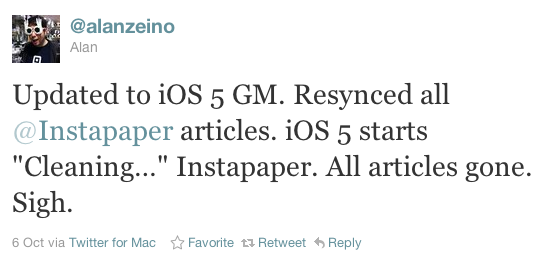
A handful of developers reported this problem happening to them with Instapaper before iOS 5 was even released to the public — I’m dreading the influx of reports about this now that iOS 5 is available to everyone.
There’s no longer anywhere to store files that don’t need to be backed up (or can’t be, by the new policy) but shouldn’t be randomly deleted. This is problematic for lots of apps, including this quick list off the top of my head:
Instapaper and anything that saves web articles for offline reading
Ebook and comic-book apps (including iBooks, if the rules apply to it)
Podcast clients (the rules don’t apply to synced podcasts from iTunes)
Offline Wikipedia apps
Offline mapping programs
The common theme is offline. It’s easy to assume that this isn’t a big problem — that surely, anything downloadable can be redownloaded at any time. But that’s not the case.
A common scenario: an Instapaper customer is stocking up an iPad for a long flight. She syncs a bunch of movies and podcasts, downloads some magazines, and buys a few new games, leaving very little free space. Right before boarding, she remembers to download the newest issue of The Economist. (I think highly of my customers.) This causes free space to fall below the threshold that triggers the cleaner, which — in the background, unbeknownst to her — deletes everything that was saved in Instapaper. Later in the flight, with no internet connectivity, she goes to launch Instapaper and finds it completely empty.
(Last week, almost this exact scenario happened to one of my customers.)
It creates a terrible experience for everyone:
She has nothing to read. (She already finished The Economist.)
My app appears to have failed and deleted her data, which makes it seem unreliable and decreases her opinion of it. If I’m lucky, she’ll email support and I’ll at least get a chance to explain myself. She’ll probably either be quietly dissatisfied or leave a 1-star review in the App Store telling everyone else that my app is unreliable and deletes data without warning, which will decrease my sales (and Apple’s 30% of those sales).
She had a terrible experience on her iPad, which now seems less reliable as a whole, which reflects poorly on Apple and iOS.
It gets worse as you consider how often redownloading data isn’t a good option or isn’t even possible:
Devices that are offline during large parts of the day, such as iPod Touches and Wi-Fi iPads
3G devices roaming internationally
Any devices, even on Wi-Fi, connected to a network with expensive data transfer or with a low monthly transfer limit (a common scenario outside the U.S.)
Devices in rural areas, where even the best home “broadband” connections available are very slow and can’t redownload hundreds of megs quickly
Devices that are about to be carried out of Wi-Fi range when the owner realizes that his content has been deleted but he’s about to be late for work or the kids are getting rained on after soccer practice or the dog is about to explode and he needs to leave right now
But even with available, fast, unlimited internet connectivity, randomly deleting an app’s data is still a problem:
When customers save an article with Instapaper, get a book in iBooks, or download a podcast with Instacast, they expect it to be there next time they launch the app. Even though it’s technically redownloadable, customers see that as their data — they put it there, and it’s theirs to remove if and when they see fit.
When the cleaner wipes it out, it appears that the app has failed and deleted their data. And customers won’t know that it’s an iOS 5 behavior — they’ll understandably blame the app developers. Even though it’s not our fault, it’s certainly going to become our problem.
There needs to be a file storage location that behaves the way Caches did before iOS 5: it’s not backed up to iTunes or iCloud, it’s not synced, but it’s also never deleted unless the app is deleted.
UPDATE: In iOS 5.0.1, Apple has added a method for developers to mark files outside of Caches and tmp as “do not back up”. Presumably, once developers adopt this as necessary, this problem should be solved.
The iPad browsing interface has been completely redesigned to feel more at home in the iPad environment. Instead of just being a blown-up full-screen list, it’s now a more touch-friendly grid, with all navigation available in any orientation:
The iPad list screen
On iPhone, the navigation has also been unified and restyled:
The iPhone list screens
Reading
The iPhone reading screens also no longer show the top status bar by default (but there’s an option to put it back). This gives a larger, less distracting reading area without sacrificing easy access to the toolbar or annoying customers with finicky full-screen tap modes.
The iPhone reading screen (dark mode, right)
Want to check the time periodically without leaving the status bar visible all the time? Just tap the Actions button in the toolbar and the status bar will slide in.
Articles from many sites now display the site title, author name, and published date when available:
(Availability of author, title, and date information will increase over time.)
The scroll bar on the right side is now draggable: simply touch the indicator for a moment to activate it, then drag to quickly scroll through an article. With the small activation delay, you won’t accidentally invoke it when scrolling normally, but it’s easy to activate when you want to.
Reading at night in dark mode is now even better, because under iOS 5, Instapaper now supports true hardware brightness control. Adjustable brightness is now also available on iPhone for the first time:
To finally end the long-standing confusion and debates between Archiving and Deleting articles, they now peacefully coexist everywhere:
When you’ve Liked an article, the Delete option is not shown, since deleting it would also remove it from your Liked list.
Wikipedia
Selecting text and tapping Define can now look up terms in Wikipedia (online) in addition to the offline dictionary:
Footnotes
Footnotes from most websites are now converted to a “…” button that shows them in a popover so you don’t need to jump to the bottom to read them:
This is a huge improvement in the usefulness of footnotes while reading. Showing similar popups with Javascript to all web browsers should really be a feature of all blogging software that generates footnotes.
Multi-select
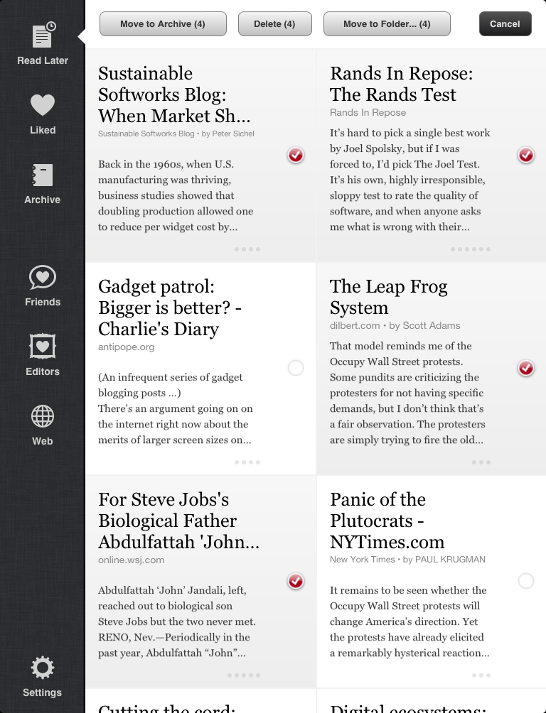
Articles can now be multi-selected, like Apple’s Mail and Photos apps, for archiving, deleting, or moving to folders:
Browsing
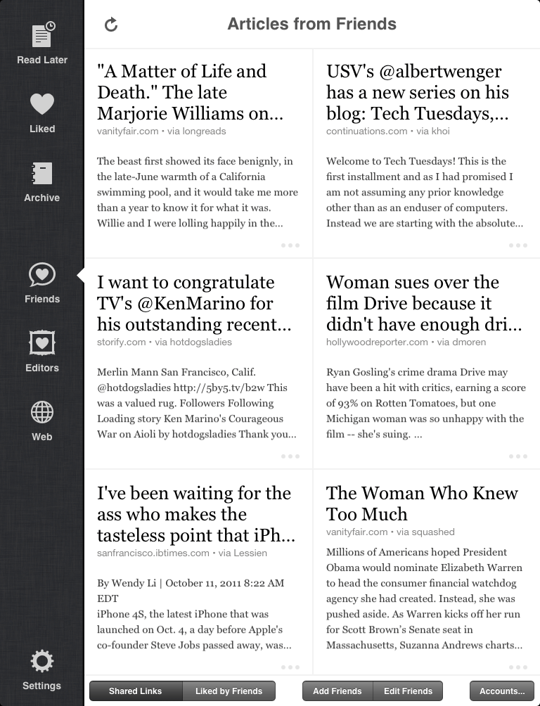
Instead of just showing Liked articles from online friends who use Instapaper, the Friends panel can now show all links posted to your Facebook news feed, Twitter timeline, or Tumblr Dashboard:
So even if your friends don’t use Instapaper as much as you do, you can still find plenty of great articles to read.
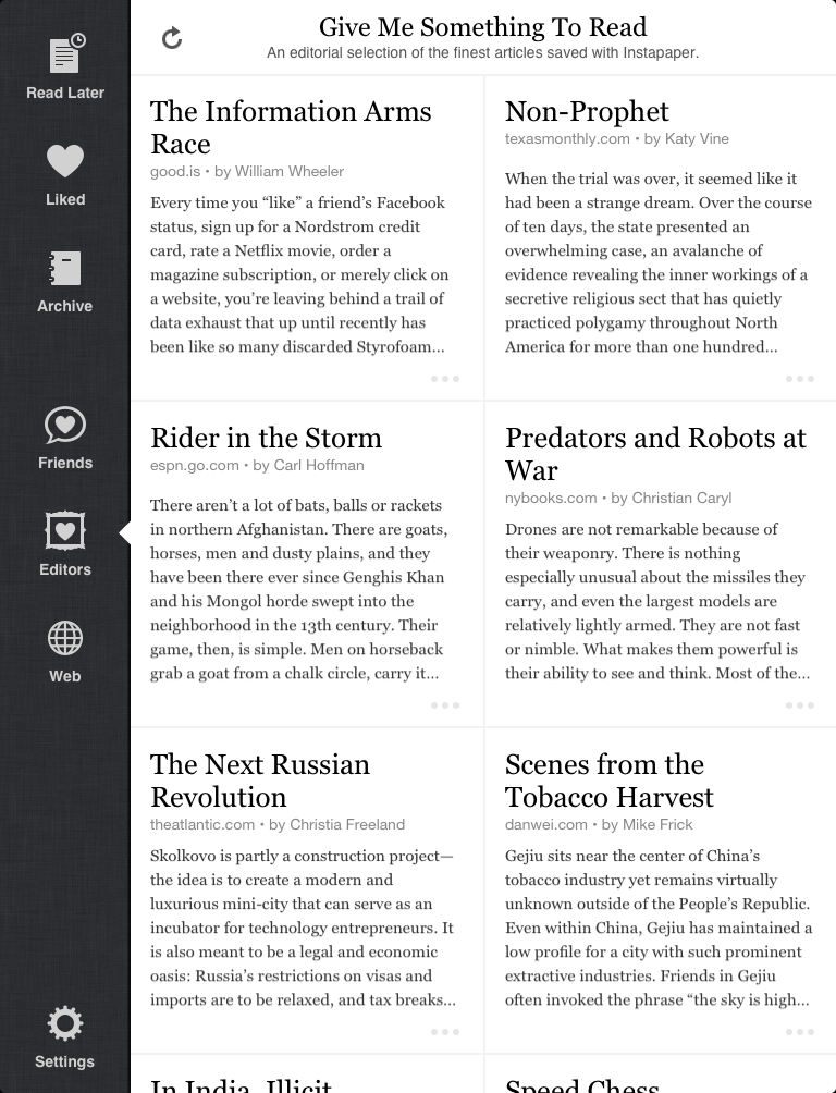
For more great articles, the Editors section has been rewritten. Now sourced exclusively from Give Me Something To Read (a.k.a. Editor’s Picks), the new interface is faster to load, faster to browse, and faster to save articles to read later:
Search
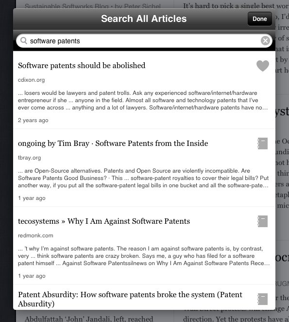
Instapaper now has a true search feature, available as part of the $1/month Subscription.
Subscribers can now search the full contents of every article they’ve ever saved to Instapaper: unread, filed into folders, or in the Archive. (Deleted items can’t be searched because they’re really deleted.)
The new search feature is built right into the app:
(This replaces the old downloaded-articles-only search in the app.)
Search is available for all Subscribers in the app today. It will be available on the website next week.
You can also now subscribe via In-App Purchase. It’s called Search Subscription. The website Subscription and the new Search Subscription in the app are the same thing, with the same features, just purchased in different ways: either PayPal or In-App Purchase.
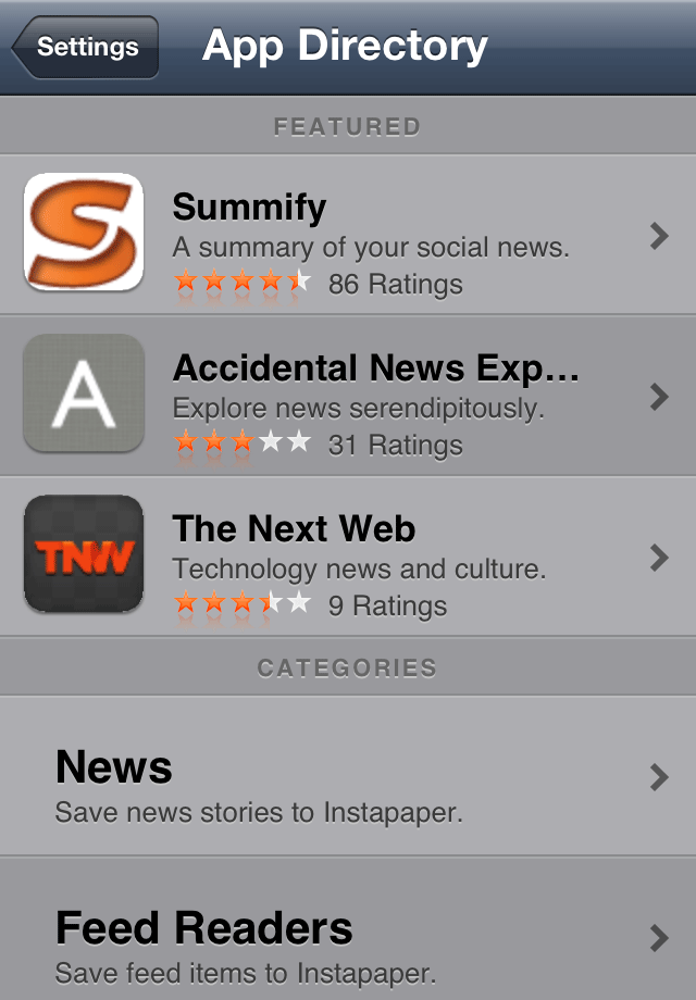
App Directory
The new App Directory showcases apps that integrate with Instapaper in various ways, such as sending articles to Instapaper or receiving links and selected text from the Share panel:
And more
Other changes in the 4.0 app:
Articles in the list or grid can be swiped to reveal a quick action menu
The in-article styling has been improved
New settings can customize the number of Liked/Archived articles stored on device
The iPhone font (ᴀA) panel has been redesigned to be like iPad’s
The iPhone share forms for Twitter, Tumblr, Facebook, Pinboard, and Evernote have been redesigned
YouTube URLs now open in the system’s YouTube app
A new setting has been added to use Apple’s dictionary under iOS 5
Tilt scrolling is now smoother and works better in all orientations
The Share panel can now send to Tweetbot and The Hit List
When updating, the entire table no longer reloads after each article downloads. It now just reloads once after the main update request, showing all (even un-downloaded) articles, and they enable themselves as they get downloaded.
Demonstrate from the top that high quality and attention to detail are prioritized and appreciated above everything else, including being the first to market, having the most features, or having the most aggressive prices. If you can get those as well, that’s great, but quality will not be sacrificed to do so.
Instill these values in your staff. If you can’t, hire a staff for which you can. Better yet, hire a staff for which you don’t need to.
Aggressively pursue simplification, elegance, craftsmanship, and the highest-class user experiences in the product line. Ruthlessly cut or hold features or entire products that aren’t good enough.
Kevin C. Tofel at GigaOM investigates the tricky problem of counting Android tablets:
Next is the question of “what is an Android tablet?” It sounds like a simple question to answer, but it’s not.
Three sizable groups are being included in this count that are questionable:
Tablets that haven’t been sold to customers yet.
Tablets running Android 2.x.
The Nook Color, which can only run most Android apps if it’s hacked.
What “counts” as an Android device is only going to get more vague over time as more “Android under the hood” devices, like the Nook Color and Kindle Fire, blur the lines.
Jeff Atwood, citing Apple’s App Store restrictions and their apparent Sherlocking of Instapaper:
As a consumer, I like that Apple is perfectly willing to throw its software developers under a bus to protect me (or, more cynically, Apple itself). But as a software developer, I’m not sure I can cope with that and I am unlikely to ever develop anything for an iOS device as a result. If you choose to deliver software in the Apple ecosystem, this is simply the tradeoff you’ve chosen to make.
I’ve written before about Safari’s Reading List and what it means for Instapaper: in short, I don’t think it will hurt sales, and it may even boost them. Indeed, with iOS 5’s release nearly two weeks ago, I haven’t seen a decline in sales at all, although there have been other factors that hardly make it a controlled experiment.1
Jeff’s main point — that iOS developers rely on Apple’s continued permission, which can be revoked at any time — is valid, although I disagree with him that such a situation is a reason to avoid developing for the platform.2 It’s simply a cost of doing business, and the potential upside is huge, so I accept it.
I can’t overstate how big the iOS market is, and how easy Apple has made it for people to pay for software. It’s one of the best environments for independent software development in history. (It’s probably the best.) And much of that is because of, not despite, Apple’s controls.
I know Apple doesn’t care about me with its decision-making. I know the risks of having an App Store app. I’m in this market because I want to be.
In the last two weeks, Instapaper was featured in the New and Noteworthy section of the App Store, Instapaper 4.0 was released (and got a lot of press), and the iPhone 4S was released, any of which alone would normally be responsible for a big sales boost. The success of the last two weeks of sales, therefore, hardly says anything either way about Reading List’s impact. ↩︎
A monarchy or oligarchy controlling a software developer’s access to customers isn’t new: ask anyone who has ever sold software in retail stores or on game consoles. ↩︎
When I walk through Best Buy, which I try to do once every few months, it feels like it’s technology at its worst, the magic of progress used as smoke and mirrors to confuse and dupe consumers rather than make their lives better.
It’s painful for me to see the sad state of consumer electronics. People are so shamelessly ripped off by low-rent retailers to get such low-quality products.
One of the reasons people get so emotionally attached to Apple is that the entire experience, from walking into the store and buying something to using it at home, is so starkly different that there’s a strong feeling that Apple is saving us from the Best Buys of the world.
My wife and I watch TV shows on a TV set, but I wouldn’t say that we “watch TV”.
To me, “watching TV” means turning on a TV set to watch whatever is “on”. More specifically, turning on the TV set and a cable box (and, for many people, a standalone audio receiver as well), to watch whatever is being broadcast on cable TV at the moment, possibly flipping through channels regularly, in order to kill time. It’s an inherently passive activity: infinite entertainment passes by with no effort or interaction required. When one show ends, another begins.
Like many modern geeks, we don’t have cable TV service. Our TV set is merely a monitor for game consoles and media players. We can watch movies and TV shows, but not live — only via iTunes and Netflix. It’s more limited than cable TV: relatively few shows are available, and we’re usually pretty far “behind” the broadcast schedule for current shows, making it difficult to talk to people about current TV shows. (This may be a feature, not a bug.) And it requires effort: when a TV episode or movie ends, nothing happens. It’s up to us to decide what to do next and make it happen: either find something else to watch, or turn off the TV and do something else.
This arrangement dramatically changed the way we watched TV. We can watch whenever we want: everything accessible to us is “on demand”. We can pause anything and resume it at any time. We haven’t regularly seen commercials since we cancelled our cable service five years ago. And we only watch shows that we actually think are good, rather than killing countless hours watching whatever’s “on” because it’s not quite bad enough to turn off.
It’s great.
Cable TV customers have attempted to gain these benefits with the DVR, but it’s a bad hack. Even the best results are more like an automated VCR than true on-demand video, and almost nobody reliably gets perfect results. The way to escape the dysfunction of broadcast TV isn’t to record it and play it back later.
But there’s seemingly no way around cable TV operators. They have effectively infinite money coming in (consider how many U.S. households are paying them $60 or more per month), they fight very hard to keep it that way, and they’ve locked up more content deals than any internet video service could hope for.
Some geeks like us are willing to accept the limitations of cable-less TV watching, but most of the mass market isn’t.
So I’m curious what Steve Jobs was planning for Apple’s TV, and whether such a product is under active development. As The Washington Post reports from Steve’s biography by Walter Isaacson:
“[Jobs] very much wanted to do for television sets what he had done for computers, music players, and phones: make them simple and elegant,” Isaacson wrote.
Isaacson continued: “‘I’d like to create an integrated television set that is completely easy to use,’ he told me. ‘It would be seamlessly synced with all of your devices and with iCloud.’ No longer would users have to fiddle with complex remotes for DVD players and cable channels. ‘It will have the simplest user interface you could imagine. I finally cracked it.’”
The simplest interpretation is that this theoretical Apple TV set would be similar to the TVs that we know today, but built with Apple’s quality and style, and with an Apple control interface. Like other TVs on the market, it would have a handful of HDMI inputs on the back for plugging in your crappy cable box and your obsolete game consoles. It would include an ATSC tuner so it can tune to your boring over-the-air networks with your crappy antenna if you aren’t paying a crappy cable company for crappy cable service. If you are paying a crappy cable company, maybe it would have a CableCARD slot or two. Either way, it can replace your crappy DVR with a less-crappy DVR implementation. And it would have all of the current Apple TV box’s functionality built in, with a nice little remote and a simple menu navigation system.
I really hope that isn’t it. That doesn’t sound like Apple.
Apple makes a class of obviously disruptive products, such as the iPhone and iPad, that blow away the industries that existed before them. They also make another class of products, such as the Airport Extreme, that don’t revolutionize their category but simply stand as high-quality implementations of what everyone else is doing. If Steve was excited about Apple’s potential entrance into the TV market, he probably intended to revolutionize it, not just make a nicer version of everyone else’s TV set.
The way to revolutionize the TV market is to cut out all of the legacy. No cable companies. No broadcast tuners. No channels. No DVRs. All internet delivery. All on-demand. No commercials.
But that’s an incredibly tall order. Apple can do a lot, but I’m not sure that they can do that, given how much of it is out of their control.
If all they do is make a really nice TV set like everyone else’s, it’ll probably be as interesting as the Airport Extreme: a nice product in its category, but not exciting or scaring the crap out of anyone.
But if they’ve managed to pull off something more interesting, I’d hate to be in the TV business when it’s released.
It’s just like the iPhone 4, but faster, with a better camera, and with Siri.
I don’t notice the speed increase.
I do notice the camera improvement most of the time, but not always.
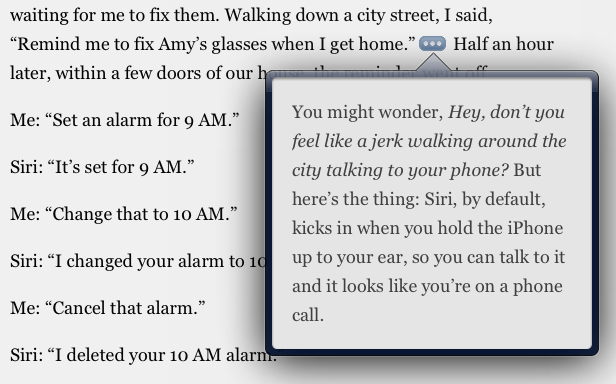
Siri is awesome. I save little chunks of time using it (“her”?) every day, and I’m now able to use my phone in previously impractical contexts. It’s also making me take more quick little notes and create more to-do items, which is making me actually do more.
I’m not an RSS reader developer any more. But if I were, I’d start looking for an alternative syncing system right now.
Google Reader decimated the market for commercial desktop and web RSS readers, then became the de facto standard for all mobile RSS readers to use as a sync platform… but with an unofficial, unsupported API, on a product that Google doesn’t seem to care much about.
The bad news is that there really isn’t an alternative RSS sync platform that I know of. The good news is that I don’t think there are any significant barriers to creating one, should it become necessary.
Apple often gets dinged for cutting support to older hardware, forcing users to upgrade if they want the latest and greatest software. So I feel it’s necessary to point out that the iPhone 3GS is 7 months older than the Nexus One. And guess what it runs? Apple’s just-released latest and greatest operating system, iOS 5.
The Nexus One was the flagship Android phone, from Google itself: an example to the other manufacturers on how to make great Android phones. Even though there weren’t a lot of them sold, cutting off support less than two years after its launch (and even less time after it stopped being sold) sends a message to the other manufacturers that it’s acceptable not to care about the long-term usage of Android devices.
This isn’t new, of course. Other Android-phone manufacturers usually cut off software updates to “old” phones even faster.
Most Android phones in the U.S., representing a huge chunk of Android’s total market share, were sold to Verizon customers on 2-year contracts. And among those, a very large portion were sold before there was a Verizon iPhone.
As these contracts come up for renewal over the next 1-2 years and these customers buy new phones, how many of them will stay with Android?
Long-term satisfaction might have a large effect on the Android retention rate and, therefore, its long-term market share. Cutting off software-update compatibility to so many phones while they’re still under contract isn’t going to do any favors for customer satisfaction.
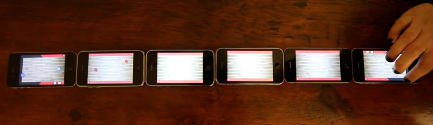
If you have multiple iPhones lying around, this is a fun little diversion.
Here’s a video I made of my wife playing a board made of 6 iPhones: one 4S, two 4s, one 3GS, and two 3Gs. (I would have included my original iPhone, but Ultimate Shuffleboard requires iOS 4.)
The animation flickers and stutters with the two iPhone 3Gs in the middle, but otherwise, it works great.
I’m getting emails almost every day asking about updates to my 15” MacBook Pro heat and fan-noise drama. Here’s the gripping conclusion to that incredibly interesting saga:
The 2.0 GHz, 6490M-equipped replacement model does indeed run much cooler than the 2.3 GHz with the 6750M that I returned. The 2.0 has far less fan noise under normal usage, with the fans only spinning up audibly when the CPUs are under a sustained moderate to heavy load.
I think my 2.3 was a lemon and exhibited its heat and fan problems unusually severely, but even a properly working one has a lot more heat to move in most usage than the 2.0 GHz model. Both the 2.3 GHz CPU and the 6750M GPU run significantly hotter than the 2.0 GHz CPU and the 6490M GPU, respectively.
The battery life of the 2.0 isn’t much better than the 2.3: if I’m conservative with brightness, force the use of integrated graphics, and don’t stress the CPU much, I can get about 3–4 hours out of it. That would have been great five years ago, but our standards are higher today.
This discussion has become mostly moot, though. A few days ago, Apple stopped selling both models and quietly updated the CPUs and GPUs across the entire MacBook Pro line. Neither a 2.0 GHz CPU nor the 6490M are available anymore: the coolest-running 15” configuration is now the maybe-too-hot 2.2 GHz CPU with the definitely-too-hot 6750M GPU. The high-end configuration, at 2.4 GHz, has an even hotter 6770M GPU.
Neither the CPU nor the GPU have undergone a die shrink and both upgrades are higher-clocked versions of their predecessors, so the heat has likely increased substantially. And now, the cooler-running configuration is gone.
Both the CPU (with Ivy Bridge) and the GPU (with the 7000 series) families are slated for significant die shrinks soon, which should cut the heat and substantially increase battery life. Increased performance of the integrated graphics with Ivy Bridge may even allow the next 15” to cut the discrete GPU entirely for even more power and heat savings. These savings could finally allow a MacBook Air-style redesign of the 15” MacBook Pro.
Ivy Bridge probably isn’t shipping until next spring. So if you’re not in a rush, I wouldn’t suggest getting the current 15” MacBook Pro. The next update is probably going to be a huge improvement.
I went back and found every Android phone shipped in the United States up through the middle of last year. I then tracked down every update that was released for each device - be it a major OS upgrade or a minor support patch - as well as prices and release & discontinuation dates. I compared these dates & versions to the currently shipping version of Android at the time. The resulting picture isn’t pretty - well, not for Android users.
Look at that graph.
It’s sad for Android users, really. The Nexus One actually had the best update record by far, and it was just cut off less than two years after its release.
I bought my first iPad magazine1 last weekend: one issue of The New Yorker.
It was $4.99. Most entire apps (including mine) cost $4.99 or less, once, and this magazine is $4.99 for just one issue. Ignoring what content and apps “should” cost, and despite knowing that this is a very good magazine, this felt expensive.
As I was flipping through it, when I saw the first of many full-page ads, I was offended. I thought, “I paid good money for this and it’s full of ads?”
Consumers have tolerated double-dipping — products that cost customers money and have ads — for over a century. It doesn’t feel as offensive in contexts that have always had it, such as printed newspapers and magazines, or cable TV.
But ads shoved into a non-free iPad or web publication feel wrong to me.
I don’t regret paying for Ars Premier or Consumer Reports because I get a clean, ad-free, reader-friendly experience in exchange. But I hesitate to pay for The New York Times because I know it’s still going to be full of ads, paginated stories, and distractions.
Maybe these different standards are because the contexts are so different: magazines, newspapers, and TV all feel cheap, since they’ve shat on consumers to make a few more cents for decades, but the iPad or a well-designed website are clean, high quality, and customer-centric.
Or maybe it’s just me. I just don’t feel comfortable paying for an iPad or web publication, no matter how good it is, and then having ads shoved down my throat. It makes me feel ripped off: what did I pay for?
Yes, I probably should try iPad magazines and newspapers more often, given the business I’m in. ↩︎
Matthew Panzarino speculates on a possible “VoiceTime” feature in the future:
But the fact is that the voice technology used by most cell phone carriers hasn’t received much attention, as the concentration has been on building out data networks and coverage areas.
So now is the time for someone to improve the voice quality of our phones, and cut one more cord away while they’re at it.
This is a great idea.
Cellular voice transmission, like satellite radio and digital cable TV, lives in the sad world of extreme bandwidth conservation: it’s compressed, processed, and crushed down to the minimum quality threshold that customers will tolerate. (And then they crush it a little bit more, because what are you going to do about it, really?)
As we see with FaceTime, the iPhone’s hardware is capable of much higher audio quality if the bandwidth is available.
A theoretical “VoiceTime” feature implemented like FaceTime — a separate type of call that people must select each time — would be interesting.
But an implementation like iMessage, where it could switch over automatically whenever both ends of a call are compatible, and we’d all just start using fewer voice minutes… that would be the kind of ballsy move that I hope the post-Steve Apple keeps making.
In the past, I’ve always recommended the Kindle over other e-ink readers, and buying Kindle books instead of iBooks on iOS, because Amazon had the biggest library of relevant titles and strongest content ecosystem.
But Amazon’s advantage is no longer as clear in my casual searching.
This isn’t anything like a formal study, so take this with a grain of salt. I think searches like this are the best way to decide which e-reader ecosystem to buy into: search for a bunch of things you might want to read, plus the last few books you bought, and see which platform has the best availability for you.
Here are some books, newspapers, and magazines I’ve searched for recently in the four biggest ebook stores, plus a few new and old bestsellers for some diversity:
Kindle
Nook
Kobo
iBooks
Walter Isaacson: Steve Jobs
$16.99
$16.99
$16.99
$16.99
Stephen King: On Writing
$12.99
$12.99
$12.99
$12.99
Nicholas Sparks: The Best of Me
$12.99
$12.99
$12.99
$12.99
Jeffrey Eugenides: Middlesex
$9.99
$9.99
$9.99
$9.99
David Simon: Homicide
$9.99
$9.99
$9.99
$9.99
Haruki Murakami: Kafka on the Shore
$11.99
$11.99
$11.99
$11.99
George Carlin: Last Words
$9.99
$9.99
$9.99
$9.99
Thomas Sowell: Basic Economics (4th Ed.)
$17.68
$31.96
$28.79
$19.99
Scott Berkun: Confessions of a Public Speaker
$9.99
$9.99
$16.39
$19.99
Michael Lopp: Being Geek
$9.99
$9.99
$16.39
X
Steve Hagen: Buddhism Plain and Simple
$9.99
$9.99
X
X
Alexander Aciman and Emmett Rensin: Twitterature
X
X
$10.99
$10.99
Don Norman: Living with Complexity
$14.72
X
X
X
(Prices in yellow are noticeably higher than the others.)
Kobo and iBooks both appear to suffer with back-catalog and niche-publisher availability, and Kobo often has higher pricing on the less popular titles, but availability and pricing of current popular titles is even across the board.
I’m particularly impressed by Kobo here: they’re much bigger than I expected.
Periodicals are a little different, since iBooks doesn’t include them directly: they must have iOS apps. Assuming that most people don’t consider the iPhone an e-reader, I limited this to iPad apps.
All periodical prices are the per-month subscription price. Where a monthly subscription wasn’t available, I used the smallest time increment available above single issues and divided accordingly:
Kindle
Nook
Kobo
iPad app
The New York Times
$19.98
$19.99
$19.99
$19.99
The Wall Street Journal
$14.99
$14.99
$14.99
$17.29
The Los Angeles Times
$9.99
$9.99
X
free
The Columbus Dispatch
$6.99
$6.99
$6.99
$28.99
The New Yorker
$2.99
$2.99
X
$5.99
TIME
$2.99
$2.99
X
$21.62
Newsweek
$2.99
$2.99
X
$4.99
The Economist
$9.99
$10.49
X
$13.33
The Atlantic
$1.99
$1.99
X
$1.83
The Nation
$1.99
$1.99
$1.99
$1.99
Car and Driver
X
$0.99
X
$1.99
Reader’s Digest
$1.49
$1.49
X
$1.99
Kobo suffered badly here: its periodical selection is very poor. (This is it.)
Kindle and Nook both did very well. I’m impressed with how much the Nook periodical selection has improved since my Nook Simple Touch review — at the time, the selection was very sad, but now it seems competitive with the Kindle’s.
Magazines that are mostly graphical or richly formatted, such as Martha Stewart’s Living, are better on tablets, not e-ink readers. I didn’t include them here, but if you primarily read them, you probably want an iPad or a Nook Color.
The newspaper and magazine experience on the iPad is very different from traditional e-readers, since they’re all individual apps instead of being built into the system reading environment. This can be good and bad: some of these publications, like the L.A. Times, TIME, Newsweek, and The Atlantic, have pretty poor iPad apps. Others, like The New York Times, The New Yorker, and The Economist, are much better experiences than any other e-reader provides.
The iPad’s color screen helps periodicals a lot, but the Nook Color and upcoming Kindle Fire have color screens, too. What helps most is the iPad’s fast and responsive navigation and interaction, and the highly advanced software components that the magazine apps can all easily use. You can read books well on any e-reader, but periodicals truly shine on the iPad. (And if your favorite periodical isn’t available, you can always go to their website — an option not usually present and usable on e-readers.)
If you’re going to primarily read periodicals, get the iPad. If you’re going to read books, all of these platforms look like safe options.
The Kindle still looks like the best ecosystem for the titles I searched for, but just barely — its advantage is much smaller than it used to be.
I’ve gotten hundreds of Twitter and email messages about my post on iPad-magazine ads. I thought I was being clear that this was simply how I felt, but that post has irritated a lot of magazine and newspaper people who seem to be misinterpreting my argument. So I’ll restate it, in brief:
I feel ripped off when I pay for an iPad or web publication and it still contains ads.
It’s not even an argument, really. It’s a feeling. From a customer. I’ve also gotten a lot of emails and tweets in agreement, so this might represent the feelings of a nontrivial amount of potential customers.
Ads as content
For many magazine genres, such as fashion or lifestyle, the ads are a desirable part of the content. I’m not talking about those here: I’m talking about magazines in which the most desirable content is the non-ad text. (“I read it for the articles.”)
“The problem isn’t ads, it’s intrusive ads”
No, the problem is ads. Ads signify to me that the money I paid isn’t enough to give me the product I thought I paid for. That’s what I called “double-dipping”: I paid with the expectation that I was paying for the entire product, and then I was unexpectedly sold out, which offends me.
(Again, this is my opinion.)
This is the same reason I find “Rate this app!” dialogs in paid apps distasteful. I paid for the app, and then it intrudes into my usage to solicit an advertisement from me to attract more buyers.
The tangible product
When I pay for a printed magazine issue — which only ever happens if I’m flying somewhere and pick up The Economist for taxi, takeoff, and landing — I don’t feel ripped off that there are ads in it.
Maybe it’s because the cover price feels like it’s paying for the physical product, and the ads feel like they’re paying for the content. But I don’t feel that distinction when buying a digital issue: that just feels like I’m paying for the content, since there’s no physical artifact. Again, I’m talking about feelings here.
“Subscribers pay far less than $4.99 per issue”
It’s becoming increasingly clear to me, as people from the industry respond, that ads are the primary business for most magazines and newspapers — that the business depends more on ad revenue than subscription fees or newsstand sales.
I don’t know the business, but I don’t think it’s a stretch to assume that the reason subscriptions are so heavily discounted from the per-issue prices is that the publishers want to encourage as many subscribers as possible, which makes their ad sales more lucrative against a guaranteed minimum audience (for whom they have lots of reliable demographic information). If the per-issue prices were very low, it wouldn’t encourage as many subscribers and the targeting would therefore be more vague, weakening the value to advertisers.
But to a new customer — someone who just bought their first single issue — it’s pretty clear that they’re getting the worst deal possible. That’s not a good way to grow a base of recurring customers.
How are newspaper and magazine subscription numbers looking these days? Not great, right? Wouldn’t it be in their best interests to encourage new customers?
“Nobody would pay the full cost, so ads are necessary”
As I said, I don’t know what I’m talking about with the specifics of the business, as so many of you have pointed out. But permit me to let my mind wander for a minute:
Ads are supposedly necessary to subsidize the publications so they can be sold at an acceptable cost to most readers. But if ads didn’t need to be sold, the staff and operations related to ad sales could be cut, reducing the cost of delivering each issue.
If the publication went digital-only, the entire infrastructure for printing and distribution could be cut, too.
If all readership is on the website and an iPad app, how much of the layout staff is necessary? Web publications don’t need custom layouts for each post. On the iPad, I find that the magazine-like layouts get in the way and make the reading experience more difficult. iPad magazine content shouldn’t look like scanned printed-magazine pages.
Are incredibly complex and expensive-to-develop iPad apps necessary, or would simpler ones suffice? Are enough customers really demanding the expensive features — especially those with big per-issue costs, like all of the multimedia “extras” — to make them worth their costs, or would most of the readership still pay the same amount for just the text and a few optional photos in a nice, reusable template? That’s how most websites publish their content, and we’re all fine with it. In many ways, such a structure could result in much better apps: adjustable fonts, text selection, highlighting, and many other reader-friendly features become much simpler to implement in such an environment. Higher quality, lower cost. (And this is a business that I can speak authoritatively on.)
With a smaller staff, and with most resources allocated to content generation, how much management and support staff could be cut? And would the huge offices in prime Manhattan locations still be necessary?
What percentage of a major publication’s cost per issue is directly responsible for the authoring and editing of the content today? Much less than half, I’d guess. (I’d love to know real numbers on this.) How much could we increase that by cutting these departments that are irrelevant or unnecessary in a modern, digital-only publication?
You can continue to call me an idiot or tell me that I have no idea what I’m talking about. (Many do, every day. It’s the cost of having a blog, an app, or an email address, and I have all three.) But there are much more interesting questions I’d like to see discussed by the people who know this business, not how much of an ass I am for feeling like paying for ads is a bad deal.
Maybe the problem isn’t my opinion on double-dipping, or the need to “educate” consumers on how much we should pay and how many ads we should tolerate, or how ads and direct payments and selling our personal information are all necessary to pay the immense cost of production.
Maybe the cost of production is the problem.
This isn’t a new argument. (Not even close.) But it’s hard for me to justify excusing an industry’s high costs that pay for work I didn’t ask for and don’t need in order to have great articles and news to read on my iPad.
Those are big problems to solve. But they’re the publishers’ problems, not the customers’. They’re implementation details. I don’t need to know why $4.99 is insufficient to pay for 15 articles on my iPad. I just know that it feels like a premium price for such a relatively small amount of content, and I don’t feel right paying premium prices for ad-subsidized products.
Maybe I’m the only one. But what does it mean for the business if I’m not? If you’re in the business, wouldn’t addressing that question be a more productive use of your time than telling potential customers that their feelings are wrong?
Looking out five or ten years, will print be the winner among these platforms? Nope. So why should we rely on print’s design conventions and workflows now?
According to these people, the consensus among sales executives for the Cupertino-based company was that the Mac Pro’s days — at least in its current form — were inevitably numbered. In particular, internal discussions were said to focus around the fact that sales of the high-end workstations to both consumers and enterprises have dropped off so considerably that the Mac Pro is no longer a particularly profitable operation for Apple.
I loved my 2008 Mac Pro. I loved its expandability, its sheer horsepower, and its ability to burn through any task I asked of it.
But Apple’s modern laptops can have SSDs that significantly outperform any number of 3.5” hard drives in a Mac Pro. Almost every computer Apple sells comes with 4 GB of RAM, and all except the MacBook Air can be upgraded to at least 8 GB very affordably. As Thunderbolt peripherals come out (assuming they do…), all Macs can now have fast disk enclosures, display adapters, and other throughput-hogging peripherals connected at full bus speed. Intel’s recent Core-series laptop and desktop CPUs are increasingly competitive with the hotter-running, much more expensive Xeon line in the Mac Pro. And every generation of Mac Pro has been more expensive than the last.
The Mac Pro was a tough sell to anyone but the most demanding users even in 2008. Today, even fewer buyers can justify it and it’s a worse deal relative to the rest of the Mac line. The Xeon E5 isn’t going to help either problem.
I bet we’ll see a minor Mac Pro update to use the E5 CPUs whenever they’re available (probably within the next few months). But it wouldn’t surprise me if that’s the last Mac Pro. It had a great run, but the tower is over.
Nicolas Barajas, who’s in the newspaper business and is qualified to analyze things like this, runs the numbers on my “outrage”: (I really wouldn’t call it that — I’m not angry when I see an ad in an iPad magazine, just dissatisfied with my purchase.)
Let’s say you’re going to reinvent The New Yorker, but as a modern, digital-only version.
I appreciate the illuminating numbers that show that it’s probably possible, but very difficult, to pull off a New Yorker-like digital magazine without ads.
I can nitpick over the numbers — $90,000 per year for every one of those employees sounds high — but the bigger issue is that I actually don’t want all of that content.
Obviously, this is a personal detail, and it’s not The New Yorker’s problem, but I skip the Goings On section and most of the Reviews. I don’t need most of the Talk, and I wouldn’t notice if half of the illustrations were missing. Less than half of the proposed staff is working on content that I’ll read: mainly, the feature articles.
I’m probably not in The New Yorker’s target market if I skip half of the magazine, so my opinion about its specifics is irrelevant. But I wonder what portion of any magazine’s audience really does care about all, or even most, of its content.
Maybe this is a bigger part of the problem than I realized. Certainly, you can’t cut anything from an existing publication without angering some of the subscribers. But creating a new magazine today with so much “content overhead” would probably seem too broad and unsustainably wasteful.
It made sense in a time when there were very few magazines. If I wanted to read long, interesting, general-audience articles written for non-idiots in 1991 (or even 2001), there were very few options, so there was more demand for these broadly targeted magazines. But today, the internet provides an effectively infinite supply of interesting articles to read (some from these very magazines’ websites), so I don’t need to subscribe to a general-purpose magazine just to enjoy select portions of it.
It’s no wonder ad-free traditional-style magazines are so difficult to fund. But that doesn’t change my dissatisfaction with flipping past ads every few pages as I’m trying to read the articles I paid $4.99 for. The problem isn’t that magazines and newspapers are greedy or badly run, but that the demand for their content and the economics that fund it have shifted so far away from what they do.