Why the Quick Bar (“dickbar”) is still so offensive
https://marco.org/2011/03/20/why-the-quick-bar-dickbar-is-still-so-offensive
Twitter’s official iPhone app, formerly Loren Brichter’s Tweetie and an otherwise awesome client, got a lot of negative reactions from the recent addition of the Quick Bar, a mandatory trending-topics banner on top of the tweet list. A lot of people really hate it, calling it the “dickbar” and often abandoning the Twitter app entirely because of it.
Its initial implementation as a floating overlay over anything you were doing in the app was far worse. Now, it’s just at the top of the main timeline, and it scrolls with the list. But it’s still offensive to most people who hated its debut, because making it scroll with the list didn’t solve the problem of it being there and being mandatory.
The reason Twitter added the Quick Bar was, presumably, to be able to feature ads, which show the “Promoted” badge:
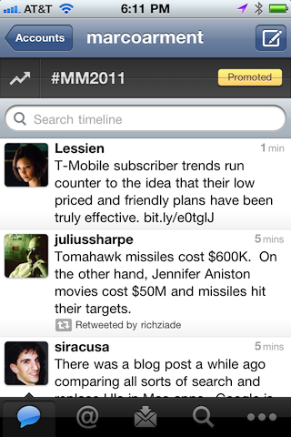
If it only ever showed ads like this, I don’t think the response would be so negative. The bigger problem is that it’s showing a random “trending” topic or hash-tag most of the time. Here are a few of the topics I’ve seen in the last 24 hours:
- LovatoAndGomez
- ChrisBrownFAMEAlbum
- Gus Johnson
- #100factsaboutme
- Wolverines
- Cingular
- GSM
- #michigan
It’s a news ticker limited to one-word items, lacking any context, broadcasting mostly topics that I don’t understand, recognize, or care about. It’s nonsensical. At worst, it can offend. At best, it will confuse.
I like the way Jeff Rock put it:
If Twitter wants to run an ad at the top of the scrollview, Twiterrific-style, I’m all for it. It’s your platform. Monetize away. But the problem with the trend bar implementation is that I’m being subjected to what I find to be the poor taste of millions of mouth-breathing buffoons in my own timeline.
What’s worse is that it’s shown in a context — my Twitter timeline — that otherwise contains only content that I’ve (indirectly) chosen to put there. (I’ve chosen who to follow based on what I want to see in my timeline.) I’m not interested in sports or celebrities or middle-school survey trends, so I don’t follow people who overwhelm my timeline with those unwanted topics.
But now, my timeline looks like this:
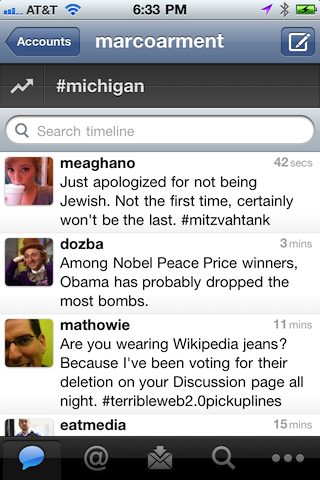
Content that I’ve chosen to follow, and… Michigan. I don’t even know what that’s supposed to mean. Presumably, there’s some bit of news happening that’s relevant to the state of Michigan, and Twitter wants users to tap on this disembodied word for a reason that’s not made clear to us.
So I tapped on it.
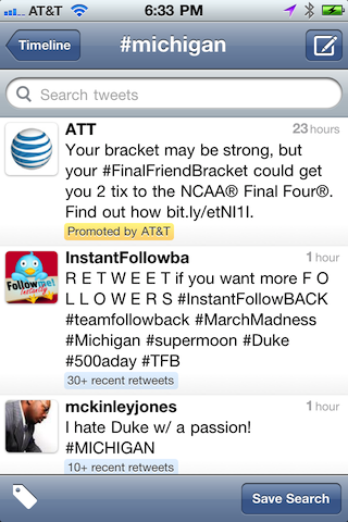
When presented with this screen — which was important enough for Twitter to be worth alienating vast numbers of influential users with the mandatory Quick Bar — what am I supposed to do?
I see, from top to bottom: intentional spam, unintentional spam, and a random person’s frivolous, meaningless tweet about sports that I don’t care about. (I scrolled down and it only got worse.) I guess Michigan is a trending topic because something important happened with a Michigan sports team.
What am I supposed to do with this information?
Am I supposed to tweet about it? If so, why doesn’t the interface encourage that? Even if I hit the (effectively invisible) New Tweet button from this screen, my tweet isn’t prepopulated with “#michigan”, so whatever I say in response won’t be included here.
Am I supposed to save this search, which the interface does encourage, so I can see this topic again in a few days or weeks or months, when it’s presumably no longer coherent or useful? (Ignoring, for the moment, that it’s neither coherent nor useful now.)
Am I supposed to read these tweets? If so, why haven’t stronger anti-spam methods or human filtering mechanisms been employed to keep the stream somewhat readable? As-is, it’s a huge and easily exploited spam target, and it shows.
We don’t know Twitter’s true reason for adding the Quick Bar. Presumably, it’s part of a longer-term strategy. But today, from here, it looks like an extremely poorly thought-out feature, released initially with an extremely poor implementation, with seemingly no benefits to users.
This is so jarring to us because it’s so unlike the Twitter that we’ve known to date. Twitter’s product direction is usually incredibly good and well-thought-out, and their implementation is usually careful and thoughtful.
And in the context of this app, most of which was carefully and thoughtfully constructed by Loren Brichter before Twitter bought it from him, we’re accustomed to Brichter’s even higher standards, which won Tweetie an Apple Design Award in 2009. (I suspect he had little to no authority in the Quick Bar’s existence, design, or placement, and it’s probably killing him inside.)
The Quick Bar isn’t offensive because we don’t want Twitter making money with ads, or because we object to changes in the interface.
It’s offensive because it’s deeply bad, showing complete disregard for quality, product design, and user respect, and we’ve come to expect a lot more from Twitter.