Kindle 3 first impressions
I got a Kindle 3 for Instapaper testing. Impressions so far:
It is noticeably smaller and lighter than the Kindle 2, but it’s still the same size class. (The screen’s the same size, and it still has a keyboard, so there’s only so far they can go.) Most people who pick up a naked Kindle 3 for the first time may overestimate the difference because they’re accustomed to using the Kindle 2 in a case.
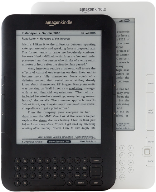
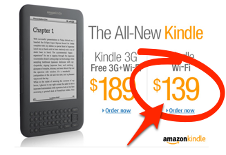
It’s so inexpensive ($140 for Wi-Fi only, $190 for Wi-Fi and 3G) that buying a $30+ case seems wasteful. And I loved getting a fancy case for my Kindle 2. (That’s still my favorite case for a gadget I’ve ever seen. It’s so immensely classy, and for the Kindle 2, necessary1.)
The form factor still encourages a case: the screen is still vulnerable to stabs and scratches from other items that share its bag, unless you’re dedicating a whole (hopefully snug) pocket to the Kindle, or you never plan to take it anywhere. But it’s also the first Kindle that I’ve been able to comfortably hold and operate without a case — mostly because of the rubberized back, replacing the Kindle 2’s smooth aluminum — so I think the ideal case would be one that isn’t clipped to it, possibly this, or maybe just a cheap plastic lid that could clip onto the front of it to protect the screen.
And cheap plastic wouldn’t be out of place. While it’s still a reasonably high-quality item, the Kindle 3 feels noticeably cheaper than the Kindle 2. It doesn’t feel quite right to spend $30 or more on a case for it.
Fortunately, you don’t need to:
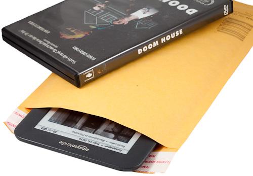
A standard 6x10 bubble envelope — the size you’d use for shipping a DVD in a case — actually makes a decent low-budget Kindle 3 slipcase. And if your goal is to just throw it in a bag and have basic scratch protection until you remove it for use, it’s a pretty good solution.2
Ergonomics
In an apparent effort to make the Kindle 3 smaller and cheaper, some of the most important buttons have been moved around. One positive change is that there’s now a Previous Page button on both sides, not just the left like the Kindle 2.
But Home, Back, and Menu have been shoved awkwardly into the keyboard area on the bottom, which I’m having a hard time getting used to. It seems incredibly unintuitive:
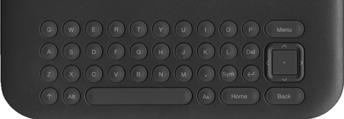
The new directional pad (they call it a “5-way controller”… the up-down-left-right thing that was a joystick-like nub in the Kindle 2) is cramped. It’s difficult to hit the directional buttons with confidence because I’m afraid I’m going to inadvertently hit the center (select) button instead.
The power-switch slider has been made much easier to slide. That’s nice, but it has also been moved to the bottom, so it’s awkward to reach, and I keep accidentally hitting it with my hands or clothes.
The next/previous-page buttons, the most important and most frequently used controls on a Kindle, have been reduced to very narrow strips on the outer edge of the Kindle 3’s left and right margins. I’m finding these more awkward to hit than the Kindle 2’s big clicky switches, which rocked toward their inner edges, but this is probably because they’re very different, not necessarily that either design is better.
The reading screen
The screen has been significantly improved, and there are subtle layout differences:
 I’ve adjusted the contrast to attempt to best represent how they look in real life.
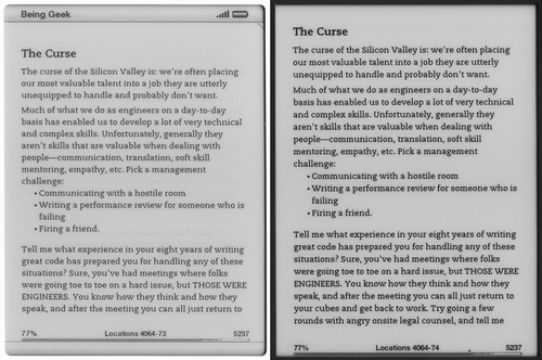
Pictured: Michael Lopp’s new book, Being Geek — recommended.
Note how the removal of the top bar and elimination of the margin below the progress indicator has added space for three more lines of text per page at this font size.
There’s a new font chooser as well: on most content, you can select between “regular”3, “condensed”, and “sans serif”:
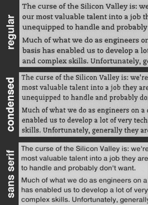
I still prefer the “regular”. There’s also a line-height option, but the default (pictured) is the largest, and the two smaller settings decrease legibility too much for my taste.
Some Kindle-edition books, such as Coders at Work, force their entire text to be in the sans-serif font. (On the Kindle 2, too.) It’s irritating. I saw this setting and hoped it would be able to override that, but it doesn’t — whichever formatting attribute forces the font to sans-serif also disables the font-face and line-height preferences on the Kindle 3. (The pictured book has the same problem as all of O’Reilly’s Kindle editions that I’ve seen: it seems to force a <BR><BR>-style paragraph break instead of the Kindle norm: book-style, tab-indented paragraphs. This also can’t be overridden by customers. I doubt that anyone important at O’Reilly is a Kindle user.)
As advertised, page-turning on the Kindle 3 is faster… sort of. The actual black-flash effect of the e-ink seems to be about the same speed as on the Kindle 2, but the delay between when you hit the next-page button and when the flash begins has been reduced to nearly zero. This is more likely due to a faster CPU in the Kindle 3 rather than an e-ink advance. Regardless, it feels faster, it’s more satisfying, and it reduces the learning curve.
The web browser
Every Kindle has shipped with a web browser, and their free cellular access makes this pretty appealing to geeks like me. The Kindle 3’s new WebKit-based browser is a huge improvement from the Kindle 2’s:
It’s still not useful enough for most people to do what they typically want to do in a web browser, but it’s functional and fast enough now that I’m glad I went with the Wi-Fi + 3G model in case I ever need to pull an xkcd. (“Functional” and “fast” are both relative to the previous Kindle browsers, which doesn’t say much. A first-generation, EDGE-only iPhone in Vermont would be more useful for web browsing than a Kindle 3.)
But, for those who haven’t used a Kindle browser, let me be clear: while this is a huge improvement over the previous Kindle browsers, you do not want to use this unless absolutely necessary.
The e-ink screen is meant to page-flip content, not scroll through it. And this isn’t a touch screen4. The result is that you need to move the virtual mouse-pointer cursor through the web page with the tiny 5-way controller. And e-ink’s refresh speed forces a small delay on every graphical change, so moving through pages is sluggish, clunky, and error-prone.
The browser is under the “Experimental” menu for good reasons. It’s a fun toy to see on the first day you get your Kindle, but you’ll quickly forget that it’s there and will probably never use it again.
The big picture
With the Kindle 3, Amazon has made most of the hardware and software better, technically. But they made a lot of the ergonomics worse. Maybe it’s because I haven’t had enough time to get used to it yet, but I can’t help but wish for the Kindle 3’s internals with the Kindle 2 button layout.
For Kindle 2 owners, the upgrade to the Kindle 3 probably isn’t worth it. But if you want to upgrade anyway, you probably won’t be disappointed.
I don’t know how many Kindle users actually use the speakers or headphone jack, but I’d guess it’s not many. And I bet a lot of Kindle users would love a smaller version without the QWERTY keyboard that would just require book purchases to be done elsewhere, or with a slow on-screen keyboard navigated by the 5-way controller. Yet the Kindle 3, despite the corners Amazon had to cut in build quality and ergonomics to get costs down, retains all of this rarely used hardware.
But the hardware isn’t the headliner for this revision. A big nitpicky hardware review (like… this) is missing the point:
Because if my support emails about Kindle 3 support are any indication, Amazon is selling a lot of these. And at that price, it’s no wonder: $140 is barely more than many iPad cases. Amazon is clearly sending a message to the market:
“We’re not competing with the iPad. You can buy both if you want.”
The iPad can do a lot more, but people who claim that it’s “killing” the Kindle are clearly not Kindle owners. Buy an iPad if you want to browse the internet, play music or video, check your email, or launch flaming peas at zombies.
But when you want to settle down and read a book, the Kindle is a much better choice.
Affiliate links to buy the Kindle: Wi-Fi model ($139) • Wi-Fi + 3G model ($189)
-
Cases for the Kindle 2 will not fit the Kindle 3. The clip-mounting holes on the Kindle 3 are spaced about a half-inch further apart. I hope there was a good engineering reason for this seemingly arbitrary change that, at worst, could be a cheap move to sell more cases to upgraders.
Update: Reader Robert M. emailed me with a good theory for this: “Amazon sells a Kindle 3 case with an extendable LED light. It gets its power from the Kindle via the metal latches. My guess is that Amazon’s old cases had an electrical path from latch to latch, and would short out the Kindle 3. (Seems like you could engineer around that, but doing so might add complexity to a device they’re trying to sell as cheaply as possible.)” ↩︎
-
As long as you don’t accidentally mail it somewhere. ↩︎
-
The standard Kindle font is still PMN Caecilia, which works incredibly well on the Kindle screen and which I’ve grown to love. ↩︎
-
Sony has released a few Readers with touch-screen e-ink displays. I haven’t seen one in person, but they’re usually panned in reviews because the touch-sensitive layer makes the screen more glossy and prone to glare. For now, at least, e-ink and touch-screens apparently can’t be combined well. ↩︎