Redesigning Overcast’s Apple Watch app
I originally designed the Apple Watch app for my podcast player, Overcast, with a scaled-down version of the iPhone app’s structure.
This seemed like a sensible adaptation of my iOS app to the Apple Watch. In practice, it sucked.
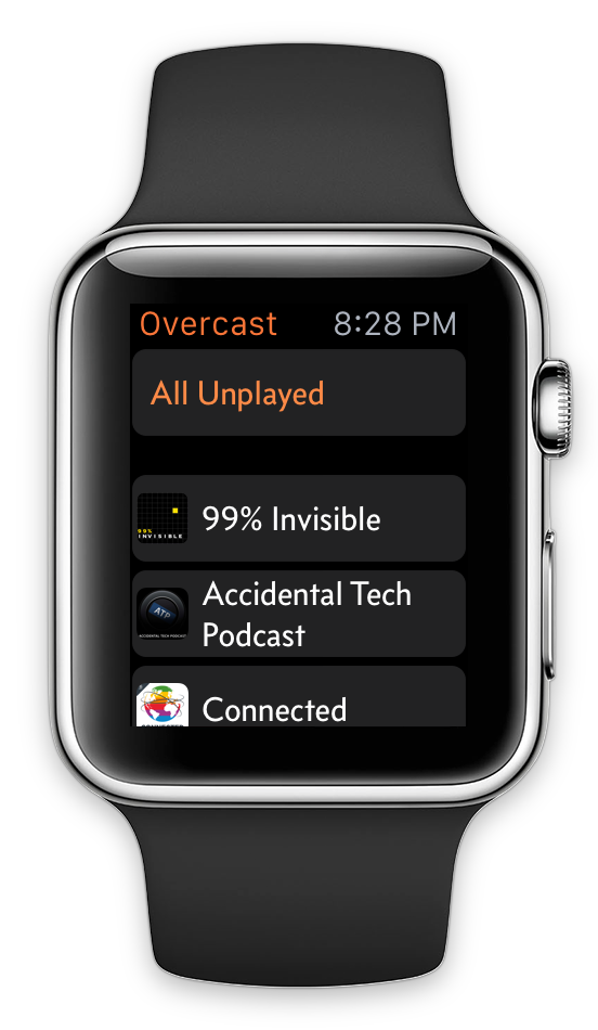
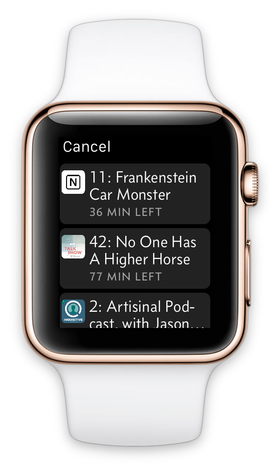
Overcast’s initial Apple Watch app.
Rationale
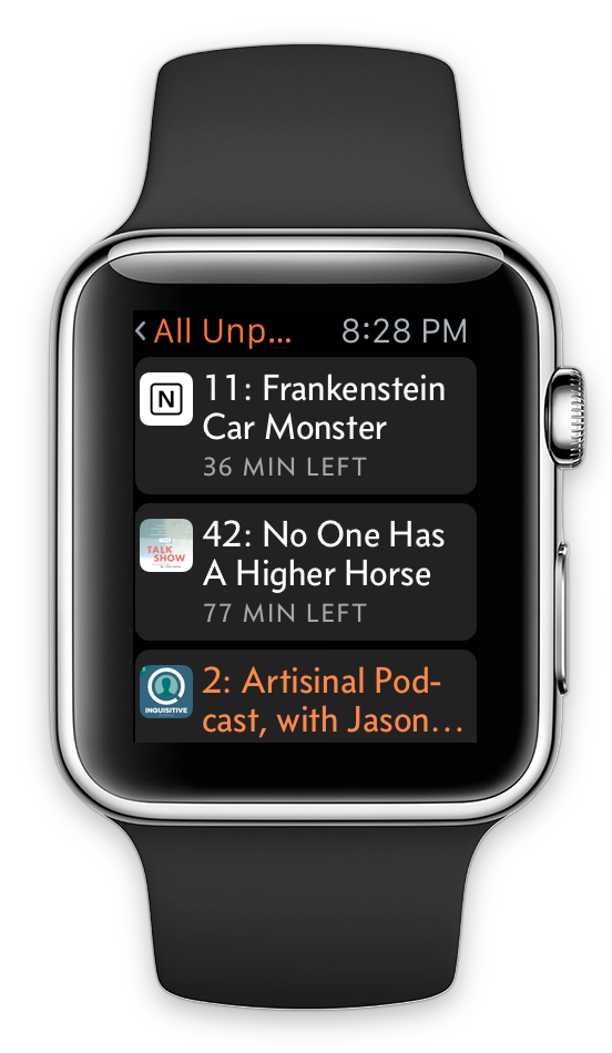
The three-level navigation hierarchy matched my iPhone app: the list of playlists and podcasts, then the list of episodes in the selected list, then the Now Playing screen.
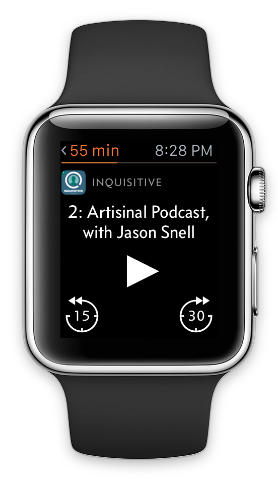
I’d arranged the play/seek controls in a spaced-out triangle to minimize accidental taps on the small touch targets. The Now Playing screen also had a Force Touch menu to change speed or effects, or recommend the current episode.
I brought my own font, for the same reason I chose it for the iOS app — it’s narrow without looking condensed, so I can fit more words per line on small screens than Helvetica-like fonts1. I even rendered the episode titles as images so I could enable hyphenation, fitting a bit more per line and reducing huge gaps. (Apple’s Watch apps use hyphenation for the same reasons, but hyphenation isn’t available in WatchKit.)
Reality
WatchKit load times are inconsistent and problematic.
Every time the interface loads or changes, the Watch and iPhone communicate round-trip over Bluetooth. Whether due to wireless flakiness, 1.0 OS bugs, or (most likely) both, WatchKit is frustratingly unreliable. Apps or glances will sometimes just spin forever instead of loading, and even when everything’s working perfectly, apps still take so long to load and navigate that the watch’s screen often turns off before you’ve accomplished anything.
My three-level navigation was a poor fit for the Watch in reality:
- The deepest level, Now Playing, was most frequently needed, so that’s where I wanted to initially launch. On iOS, you can jump navigation levels immediately on launch without animation, but in WatchKit, every level must be partially loaded and then pushed down with animation. This made load times even slower, and added more round-trip UI actions that increased the risk of getting stuck forever.
- I had to add complex logic to keep the lists updated in the bottom two levels as the data changed, even while they were off-screen. This increased code complexity, bug potential, and chatter with the phone.
- To keep the lists loading quickly, I had to initially only load a few rows, then gradually “autoload” the rest in short bursts over the next few seconds. This seemed to cancel many touch interactions that happened while autoloading, making navigation slower and more frustrating.
- In practice, I just don’t like navigation hierarchies on the Watch. They feel even slower than other WatchKit UIs, and tapping the tiny Back buttons or swiping back from the edge are frustratingly error-prone.
After using my initial app on a real Apple Watch for just one day, I set out to completely rethink and restructure it.
Rethinking
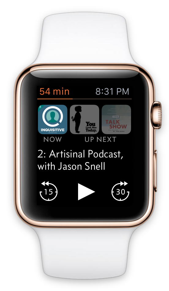
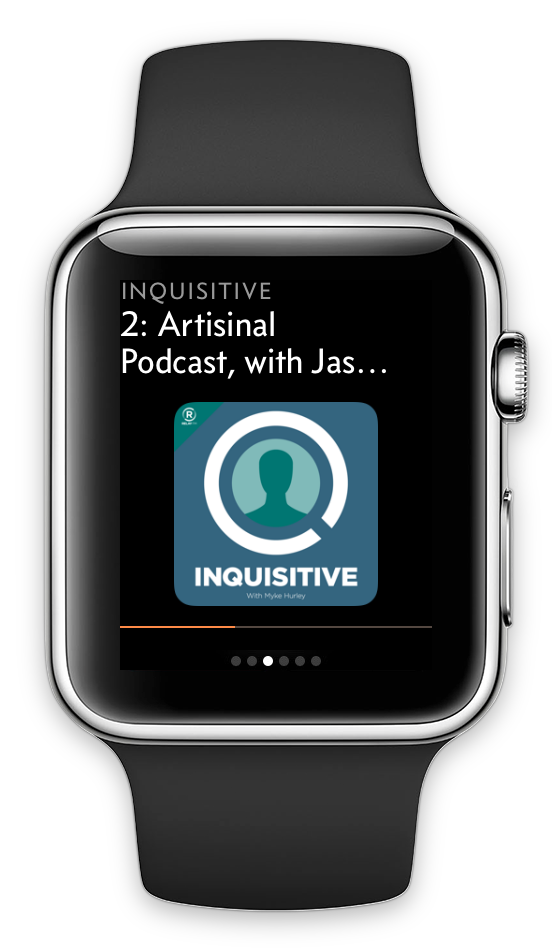
To simplify both the code and the workload on WatchKit’s fragile data connection, I rebuilt the app with the Now Playing screen as the single, main, root screen, with other screens sliding up as modal views only when needed. This dramatically improved loading time and reliability, and removed the need to keep the list screens updated in the background as data changed.
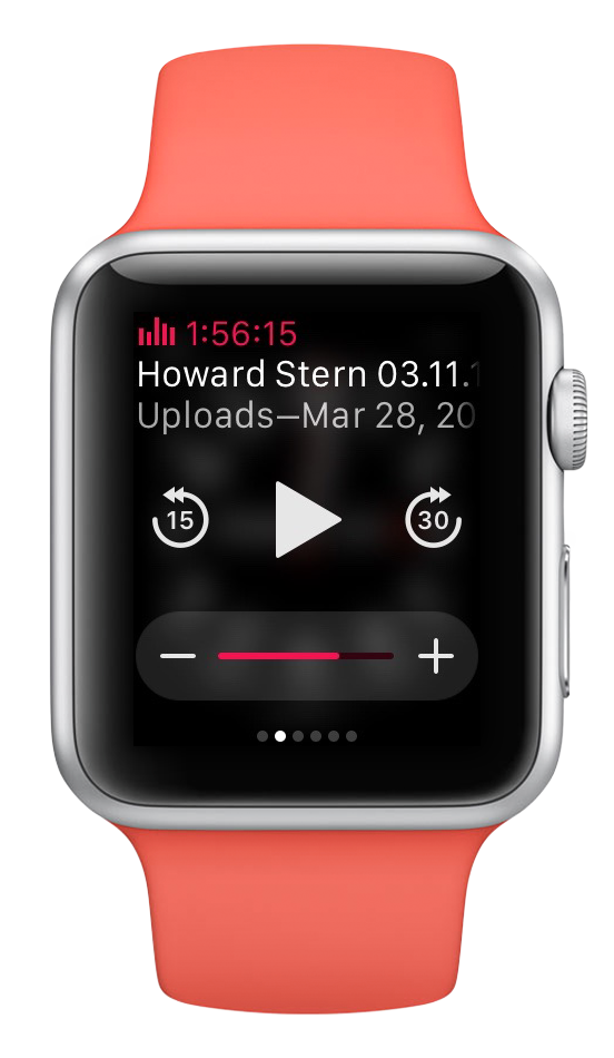
Old app is on the black-banded watch (left), new app is on the “Jony Ive” white Edition (right).
I experimented with a scrolling main screen and side-by-side “page” interfaces, but neither were as good as a single non-scrolling screen: not only did the single screen require less loading, but any scrollability in either direction requires touches to be slightly delayed (to determine whether they’re swipes) and sometimes misinterprets taps as unintended swipes.2
I also made the Now Playing screen more useful based on what I actually wanted in practice from a Watch app:
- I wanted to see which podcasts were up next, and have the ability to change them. I kept pulling my phone out to do this instead.
- My triangular button arrangement, which was very costly in screen space, proved unnecessary. Apple’s media glance uses a three-across button layout and it’s fine, and it’s better for me to match it for user consistency anyway.
- Observant font geeks may also notice my lighter title-font weight to better match the system font.
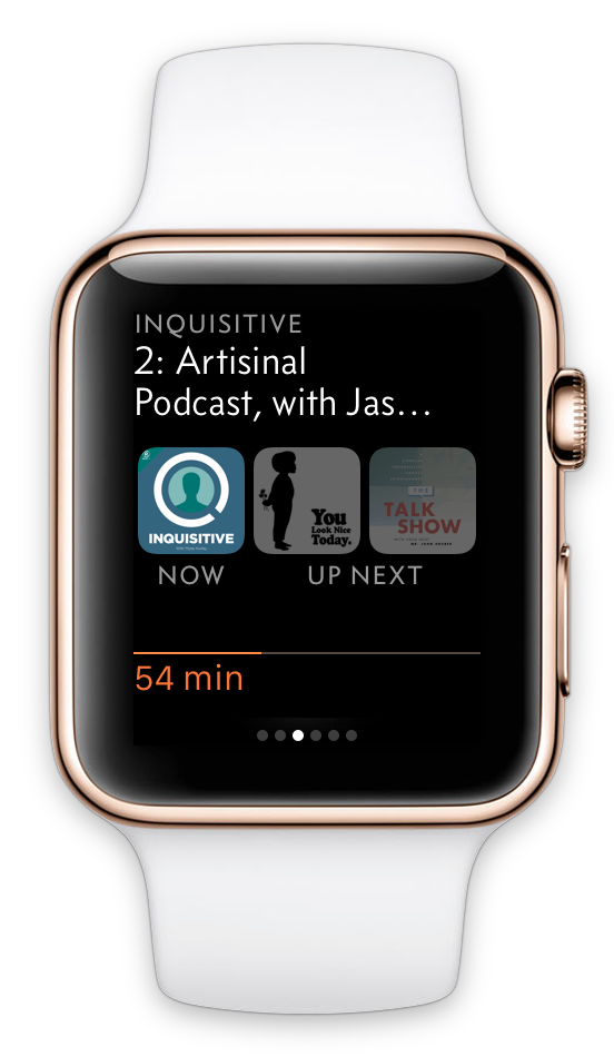
New Now Playing screen, and the menus when you tap the “Now” and “Up Next” artwork.
Despite moving to a single-main-screen interface, the new app has more functionality:
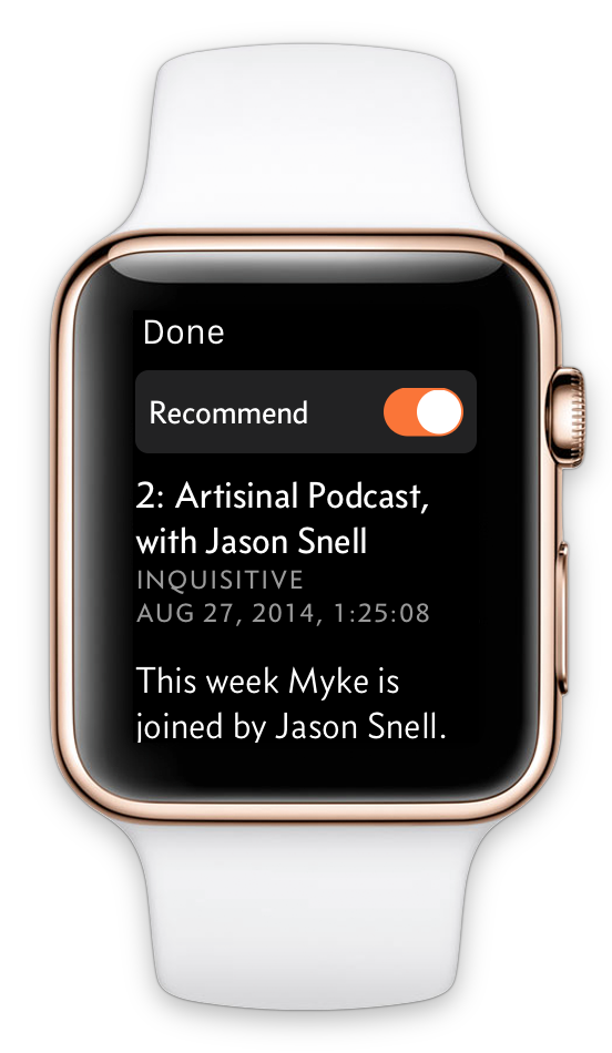
- Tapping the Now Playing artwork brings up more episode info and promotes recommendations from the Force Touch menu to the visible interface.
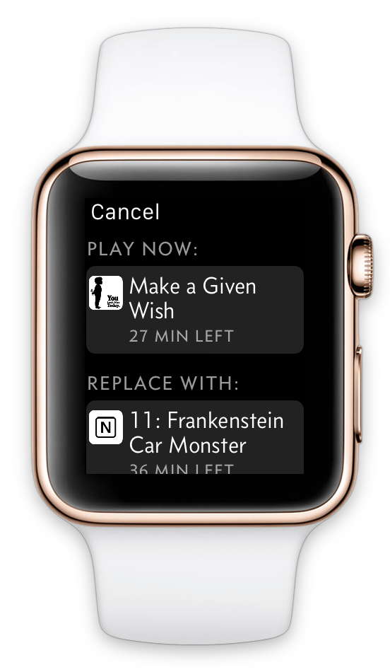
- Tapping either Up Next artwork brings up a menu to either play it now or move another podcast from the playlist into its place.
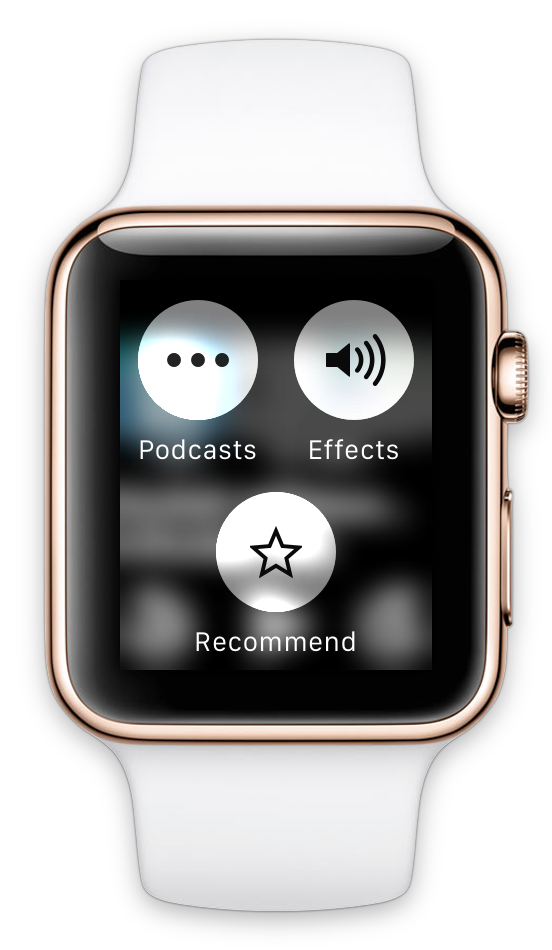
The Force Touch menu remained with the Effects pane and a Recommend shortcut, and now it’s on the only main screen of the app, making users more likely to find it.
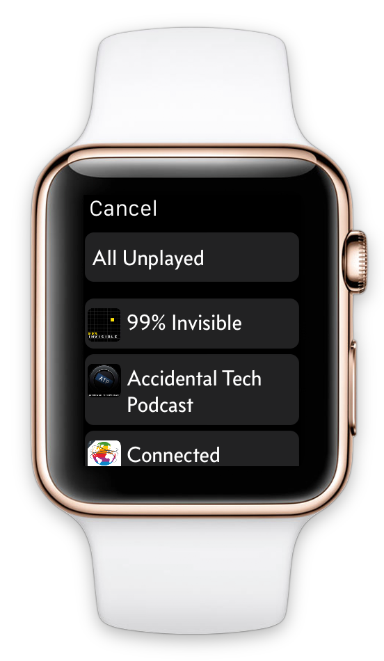
Its new Podcasts item is how people browse to other podcasts and playlists (since I don’t have a navigation stack anymore), which I feel comfortable burying here because it’s infrequent in practice — Overcast’s playlists are designed to let you “live” in one most of the time, set priorities, and rearrange it as you like. And since this browsing interface is on-demand and short-lived, I removed all of the slow, error-prone live-sync logic.
Force Touch menu and the Podcasts browser.
I had also initially underestimated glances, which are very important in practice. Going out to the honeycomb app screen to launch apps is cumbersome — it’s much more compelling to keep a small number of glances, using them (and complications, which I really want third-party access to) as status updates and quick app-launching shortcuts.
WatchKit glances can’t contain any buttons — tapping them just launches the app — so mine couldn’t hold a candle to the usefulness of Apple’s built-in media glance, especially since Apple’s is always loaded with no delay, while mine may show stale data for a few seconds while it refreshes (just like old Mac Dashboard widgets).
Even given the constraints of WatchKit glances, my initial glance wasn’t very useful. It only displayed the current episode and an approximation of a progress bar. The new glance includes all of the information from the Now Playing screen, so launching the app is only necessary to make changes:
Apple’s media glance, Overcast’s initial glance, and Overcast’s new glance.
Results
Friends and beta testers have all had similar reactions:
- Day 1: “That’s a bit weird.”
- Day 2: “I get it now, and this is so much better.”
I’m much happier with the new app.
Trying to match the structure of the iOS app was a mistake. For most types of apps, the Apple Watch today is best thought of not as a platform to port your app to, but a simple remote control or viewport into your iPhone app.
My initial app was easier to conceptualize and learn, and it closely matched the iOS app. But it just wasn’t very good in practice, and wasn’t usually better than taking out my phone.
The new app is a bit weird and polarizing, and has a learning curve, but it’s great in practice if it fits your preferences. (Just like the Apple Watch.)
Reflection
It’s unwise and futile to try to shove iPhone interfaces and paradigms into the Apple Watch. Instead, design for what the Watch really is.
Because WatchKit 1.0 is so limited and performance is so inconsistent, it’s hard to make Watch apps that are truly useful compared to just taking out your iPhone and using the full app. I believe this will always be the case to some degree, even after we get a native SDK.
Just as not every Mac app can have a useful corresponding iOS app (or vice versa) due to the physical nature and OS paradigms of iPhones and iPads, not every iPhone app can or should have a useful Watch app. Conversely, there’s a lot of new opportunity here: plenty of compelling Watch apps would’ve been much less compelling on the iPhone.
The Watch seems to fit on a continuum somewhere between the iPhone and, say, a Bluetooth headset — part peripheral, part computer — and it will likely stay there. Not every computing device should or will become a general-purpose platform. Today, software limitations are partially to blame for the Watch not replacing your iPhone, but it’s mostly due to physical limitations and ergonomics that won’t change significantly over time, just as tablets haven’t replaced laptops and likely never will. The newest Apple Watches in ten years still won’t be able to make the average human wrist bigger or give wearers a third hand, and the phone in your pocket will always have space for an order of magnitude more battery capacity and a screen big enough to type on.
So I don’t think the smartwatch will ever replace the smartphone as the dominant general-purpose mobile device. But there’s a lot that it can do, much of which it can do better than the smartphone, and we still have a lot of learning to do and assumptions to shed to unlock its potential.
-
I also like Concourse because it’s sans-serif but very distinct from Helvetica, it’s casual without looking anything like Comic Sans, it has some personality but not too much, and it looks great in small caps. (You should’ve seen how many fonts I auditioned for the iOS app before picking this one.) ↩︎
-
This is why I love-hate the Solar watch face: I love its look and the information it conveys (although it really needs complication support), but it’s scrollable — scrolling the Crown moves the sun around, which I never want to do — and I often accidentally scroll it slightly when trying to press the Crown in, which cancels the press. ↩︎